Multiple Correspondence Analysis: A Political Example

MULTIPLE CORRESPONDENCE ANALYSIS

Correspondence analysis and multiple correspondence analysis are techniques from multivariate analysis. You can use the techniques to find clusters in a data set. Correspondence and multiple correspondence analysis are similar to principal component analysis, in that the analysis attempts to reduce the dimensions (number of columns or rows) of a set of intercorrelated variables so that the smaller dimensioned (number of columns or rows) variables explain most of the variation in the original variables. However, correspondence and multiple correspondence analysis are for categorical variables rather than the numerical variables of principal component analysis. Correspondence analysis was developed by Jean Paul Benzecri and measures similarities of patterns in contingency tables.

The Mathematics Behind Correspondence Analysis

Correspondence analysis is used in the analysis of just two categorical variables. In correspondence analysis, the reduced variables are found by applying singular value decomposition to a transformation of the contingency table created from the two original variables. The transformation replaces the value in each cell of the contingency table by the original value minus the product of the row total and the column total divided by the overall total, with the difference divided by the square root of the product of the row total and the column total. The resulting cells then contain the signed square roots of the terms used in the calculation of the chi square test for independence for a contingency table, divided by the square root of the overall total.

The Mathematics Behind Multiple Correspondence Analysis

For multiple correspondence analysis, more than two categorical variables are reduced. The reduced set of variables is found by applying correspondence analysis to one of two matrices. The first matrix is a matrix made up of observations in the rows and indicator variables in the columns, where the indicator variables take on the value one if the observation has a quality measured by the variable and zero if the individual does not. For example, say there are three variables, ‘gender’, ‘hair color’, and ‘skin tone’. Say that the categories for gender are ‘female’, ‘male’, ‘prefer not to answer’; for hair color, ‘red’, ‘blond’, ‘brown’, ‘black’; and for skin tone, ‘light’, ‘medium’, and ‘dark’, then, there would be three columns associated with gender and, for a given person, only one would contain a one, the others would contain zeros; there would be four columns associated with hair color and, for a given person, only one would contain a one, others would contain zeros; and there would be three columns associated with skin tone and, for a given person, only one would contain a one, the others would contain zeros.

The second type of matrix is a Burt table. A Burt table is multiple sort of contingency table. The contingency tables between the variables make up blocks of the matrix. From the example above, the first block is the contingency table of gender by gender, and is made of up of a diagonal matrix with the counts of males, females, and those who did not want to answer on the diagonal. The second block, going horizontally, is the contingency table of gender by hair color. The third block, going horizontally, is the contingency table of gender by skin tone. The second block, going vertically, is the contingency table of hair color by gender. The rest of the blocks are found similarly.

Plotting for Clustering

Once the singular value decomposition is done and the reduced variables are found, the variables are usually plotted to look for clustering of attributes. (For the above example, some of the attributes are brown hair, male, red hair, light skin tone, each of which would be one point on the plot.) Usually just the first two dimensions of the reduced matrix are plotted, though more dimensions can be plotted. The dimensions are ordered with respect to how much of the variation in the input matrix the dimension explains, so the first two dimensions are the dimensions that explain the most variation. With correspondence analysis, the reduced dimensions are with respect to the contingency table. Both the attributes of the rows and the attributes of the columns are plotted on the same plot. For multiple correspondence analysis, the reduced dimensions are with respect to the matrix used in the calculation. If one uses the indicator variable matrix, one can plot just the attributes for the columns or one can also plot labels for the rows on the same plot (or plot just the labels for the rows). If one uses the Burt table, one can only plot attributes for the columns. For multiple correspondence analysis, the plots for the columns are the same by either method, thought the scaling may be different.

Interpreting the Plot

The interpretation of the row and column variables in correspondence anaylsis is done separately. Row variables are compared as to level down columns and column variables are compared as to level across rows. However if a row variable is near a column variable in the plot, then both are represented at similar relative levels in the contingency table.

The interpretation of the relationship between the variables in the indicator or Burt table is a bit subtle. Within an attribute, the levels of the attribute are compared to each other on the plot. Between attributes, points that are close together are seen at similar levels.

An Example Using the Deficit by Political Party Data Set

Below is a multiple correspondence plot for which only the column reduction is plotted. We look at the size of the deficit (-) / surplus (+) using the political affiliation of the President and the controlling parties of the Senate and the House of Representatives. The size of the onbudget budget deficit (-) / surplus(+) as a percentage of gross domestic product for the years 1947 to 2008 was classified into four classes. The largest deficit over the years was -6.04 percent and the largest surplus was 4.11 percent. The class breaks were -6.2, -4, -2, 0, and 4.2, which gives four classes. (There was only one observation with a surplus greater than 2, so years of surplus were all classed together.) Each of the President, Senate, and House variables were classified into two classes, either Democrat or Republican. Since the budget is created in the year before the budget is in effect, the deficit (-) / surplus (+) percentages are associated with the political parties in power the year before the end of the budget year.

Multiple correspondence analysis plots of deficit / surplus as a percentage if GDP by party of president, senate, and house

The first principal axis appears to measure distance between the relative counts for the parties of the senate, and house. On the plot, the greatest distances on the first principal axis are between the Republican and Democratic senates and the Republican and Democratic houses. Looking at the tables below, the lowest counts were for the Republican senates and houses, which means the highest counts were for the Democratic senates and houses. For the deficit classes, classes (0,4.2] is the smallest class in the table and, like the Republican senates and houses, is to the left on the plot. Still there is not much difference between the deficit classes on the first principal axis (or the parties of the presidents).

The second principal axis appears to show how the differing levels of deficit (or surplus) are associated with the political parties of the presidents, senates, and houses. Looking at the senates and houses, there is not a lot of difference between the Democrats and the Republicans on the second principal axis, both cluster around the deficit class (-4,-2]. For the presidents, however, there is a great difference. Democratic presidents are near the deficit classes (-2,0] and (0,4.2] on the second principal axis while Republican presidents are between the deficit classes (-4,-2] and (-6.2,-4].

Below are two classifications of the data.

Deficit Classes
(-6.2,-4] (-4,-2] (-2,0] (0,4.2]
11 22 21 8
Political Parties
Party President Senate House
Democrat 27 42 48
Republican 35 20 14

In this example, we have treated the deficit, which is a numeric variable, as a categorical variable. In the post before this post, an example of principal component analysis, the same data is analyzed, with all of the variables treated as numeric rather than categorical.

Principal Component Analysis: An Example

Principal component analysis is a technique from multivariate analysis for data sets with numeric (as opposed to categorical) variables. If you are interest in how variables in a data set relate or you are dealing with multicollinearity, you would probably find principle component analysis useful. According to the Wikipedia entry on principal component analysis, principal component analysis was invented by Karl Pearson in 1901. The purpose of principal component analysis is to reduce the number of dimensions of a set of measurements.

What Principal Component Analysis Involves

Say we have a data set of four measurements on 62 observations. The data set then has four dimensions in the columns. Using principal component analysis, we can find four vectors composed of weighted linear combinations of the original four measurements which contain the same information as in the original four measurement vectors, however, which combinations are linearly independent. (If a set of vectors are linearly independent, then the cross-product matrix of the vectors is diagonal.) Usually, the first few linear combinations explain most of the variation in the original data set. Say, in our example, that the first two linear combinations explain 85% of the variation in the data set. Then, we could approximate the original data using the first two vectors. The vectors are called either the first two principal components or the scores of the first two principal components. The weights used to find the scores are called the loadings of the principal components.

The principal components can be used in regression analysis. In the example above, the first two principal components could be used in place of the four original measurements to get rid of problems from multicollinearity. The principal components can also be used in cluster analysis. By plotting the first two scores against each other and labeling the points with the row labels, one can see if different observations cluster together. By plotting the first two loadings against each other, we can see if there is clustering within the measurement variables. The principal components can be used to see underlying relationships within the data. The loadings can have meaning in terms of understanding the data.

The Mathematics Behind Principal Component Analysis

Given a data set, the loadings are the eigenvectors of either the variance-covariance matrix or the correlation matrix of the data set. The two methods do not give the same result. Usually, the correlation matrix is used because in the correlation matrix the variables are normalized for size and spread. The scores are found by multiplying the original data – the normalized data if the correlation matrix is used – on the right by the eigenvectors. In the matrix of eigenvectors, the eigenvectors are in the columns.

Eigenvalues have an important role in principal component analysis. Eigenvectors are sorted by the sizes of the corresponding eigenvalues, from largest to smallest. An eigenvalue using a correlation matrix is proportional to the proportion of the variation in the data set explained by the principal component associated with the eigenvalue. For a full rank correlation matrix, in most programs, the sum of the eigenvalues equals the dimension of the correlation matrix, which equals the number of columns in the data set. The magnitudes of the elements of the eigenvectors are relative with respect to the magnitudes of the eigenvalues. The magnitudes of either, separately, are not determinate. In the above explanation, we assume the eigenvectors are normalized such that the inner product of each eigenvector equals one, which is usual.

An Example Using the Deficit by Political Party Data Set

We will use the data in The Deficit by Political Party Data Set* to demonstrate the power of principal component analysis as a clustering tool. We look at the size of the on budget deficit (-) (surplus (+)) as a percentage of the gross domestic product using the political affiliation of the President and the controlling parties of the Senate and the House of Representatives. Since the budget is created in the year before the budget is in effect, the deficit (-) (surplus (+)) percentages are associated with the political parties in power the year before the end of budget year. We will only look at years between the extreme deficits of the World War II years and the current extreme deficits.

In order to code the categorical values for political party numerically, we let Democrats take in the value of ‘1’ and Republicans take on the value of ‘-1’. Our data set has four variables and 62 observations. The variables are the deficit (-) (surplus (+)) as a percentage of the gross domestic product for the years 1947 to 2008, the political party of the President for the years 1946 to 2007, the political party controlling the Senate for the years 1946 to 2007, and the political party controlling the House for the years 1946 to 2007. Below are two plots of the rotation of the four variable dimensions projected onto the two dimensional plane using the first two eigenvectors, each multiplied by the square root of the eigenvector’s eigenvalue, one for the covariance method of calculation and the other for the correlation method.

First two eigenvectors plotted against each other - with and without normalization

Normally, in principal component analysis, a biplot is created containing plots of both the loadings and the scores. Because three of our variables are dichotomous, the plots of the scores are not very interesting and I have not included the plots. For the covariance method, the first two principal components account for 86% of the variation, and for the correlation method, the first two principal components account for 79% of the variation.

We can see that the parties of the Presidents and the deficits are strongly correlated with each other in either plot, while the Senates and Houses are more weakly correlated with each other in the correlation plot but strongly correlated in the covariance plot. The deficits and the parties of the Presidents do not seem to be strongly correlated with the parties of the Senates or Houses in either plot. In the covariance plot, the lengths of the vectors differ much more than in the correlation plot, since the measurements are not standardized. Basically, the two plots give the much same information.

Below is a table of the eigenvectors and eigenvalues for the correlation method.

Eigenvectors and Eigenvalues for the Correlation Method
variable eigenvector 1 eigenvector 2 eigenvector 3 eigenvector 4
deficit 0.380 0.583 0.712 0.090
president 0.378 0.587 -0.701 0.145
senate -0.539 0.487 -0.024 -0.687
house -0.650 0.279 0.029 0.706
eigenvalue 1.683 1.462 0.506 0.350

We can see from the table that the first eigenvector is a contrast between the deficit / President and the Senate / House.  Democrats have a positive value and Republicans a negative value in the normalized matrix of measurements. So, for the deficit and the party of the President, deficits that are positive in the normalized data are positively associated with Democratic presidents and deficits that are negative in the normalized data are positively associated with Republican presidents. For the House and Senate, Republican Senates are associated with Republican Houses and Democratic Senates are associated with Democratic Houses. Together, positive normalized budget deficits and Democratic presidents align with Republican Senates and Houses and contrast with Democratic Senates and Houses.

The second eigenvector lumps together, weakly, the deficit, President, Senate, and House. Here, Democrats, at all levels, are aligned with positive values of the normalized deficit and for Republicans, negative deficits are associated with Republicans at all levels.  Also, Democrats are aligned with Democrats and Republicans are aligned with Republicans.

The third eigenvector is mainly a contrast between the deficit and the party of the President. Positive normalized deficits are contrasted with Democratic presidents and aligned with Republican presidents.

The fourth eigenvector is mainly a contrast between the parties of the Senate and House. Democratic Senates are contrasted with Democratic Houses and aligned with Republican Houses and vice versa. The last two eigenvectors only account for a small portion of the variation.

*The Deficit by Political Party Data Set

The deficit by political party data set contains data on the total and on balance deficits, the gross domestic product, and the political parties controlling the presidency, the senate, and the house for the years 1940 to 2011. The data for the deficits and the gross domestic product are from the Office of Management and Budget and can be found at http://www.whitehouse.gov/omb/budget/Historicals. Before 1978, the budget year ran from July 1st to June 30th. From 1978 onward, the budget year ran from October 1st to September 31st. The tables contain a one quarter correction between the years 1977 and 1978, which I have ignored. The data for 2011 is estimated. The year with which the deficit and gross domestic product are associated is the year at the end of the budget year for which the deficit and gross domestic product are calculated.

The data for the controlling political parties of the president, senate, and house were taken from the website of Dave Manuel, http://www.davemanuel.com/history-of-deficits-and-surpluses-in-the-united-states.php, a good resource on the history of the deficit.

Numerology and Presidential Birth Dates

Numerology

From Where Comes Numerology?

We start with a short description of from where numerology comes and what numerology is.

Numerology is an arcane system of beliefs about numbers which comes to us out of the depths of time. According to my main reference for numerology, Numerology Has Your Number, by Ellin Dodge, published by Simon and Schuster, in 1988, early humans found numbers to be magical and early civilizations gave special significance to numbers. The numerology that we use today is ascribed to the Ancient Greek mathematician, Pythagoras. (Pythagoras is the same Pythagoras known for the Pythagorean theorem in mathematics.) Ms. Dodge writes that, as far as we know, the system was passed down by his disciples. Historians do not think Pythagoras wrote down his numerological system.

Numerological Basics

The basic numbers used in numerology are the digits one through nine. According to numerology, each of the digits has a variety of meanings (e.g., one meaning associated with the number two is cooperation). Since most numbers contain more than one digit, numerologists must reduce numbers to one digit for interpretation. Any number that does not contain indefinitely many digits may be reduced to a single digit by repeatedly adding the digits in the number. For example, 2429 sums to 17 ( 2 plus 4 plus 2 plus 9 ), which sums to 8 ( 1 plus 7 ), so the numerological number associated with 2429 is eight.

In mathematics, when one divides any positive integer by any other positive integer, the remainder is called the original integer ‘modulo’ (or ‘mod’) the other integer. Finding the value of any positive integer modulo nine gives the same result as repeatedly adding the digits in the integer, provided zero is set to nine in the final result. To continue on with the example given in the last paragraph, 2429 divided by 9 equals 269 with a remainder of 8. We can see that the remainder is the same as the number found by repeatedly adding the digits in the number. For another example, 207 divided by 9 equals 23 with a remainder of 0, which we set equal to nine. Using the numerological method, 2 plus 0  plus 7 equals 9.

Dates can be reduced to a digit by adding the sum of the digits in the month’s number (e.g., 8 for August or 1 plus 1 for November) to the sum of the digits in the day of the month (e.g., 2 plus 8 for the 28th) to the sum of the digits in the year (e.g., 2 plus 0 plus 0 plus 9 for 2009). Today is October 1, 2009, so the numerological number associated with this day is 4 (1 plus 0 plus 1 plus 2 plus 0 plus 0 plus 9 and 1 plus 3).

image of a table of the US presidents' birth dates

Birth Dates

Birth dates have a special meaning in numerology. Ms. Dodge calls the numerological number associated with a person’s birth date the destiny number. According to Ms. Dodge, destiny numbers represent where we are going in life, what we have to learn. For example, persons with the number two destiny are learning cooperation and the art of making peace. I think of number two people as deal makers, coordinators of people. On the other hand, persons with the number eight destiny are learning about material success and the management of resources and people. The number eight is associated with material ambition.

Birth Dates of the Presidents

I tend to calculate the numerological number of dates when I see them, so, when I was looking through a pamphlet about the U.S. presidents, just out of curiosity I calculated all of the presidents’ destiny numbers. I noticed that the earlier presidents seemed to have smaller destiny numbers than the later presidents, particularly if one ignores the two’s and the eight’s. To the left of this page is a list of the presidents along with the presidents’ birth dates. Also, I have included a plot of the presidents’ destiny numbers below. The pamphlet was one that my family picked up when I was young and did not have the more recent presidents, so Reagan’s, Clinton’s and Obama’s two’s were not in the pamphlet.

plot of the presidents' destiny numbers by president

Statistics

Where to Start?

Being a statistician, I began to think about how one could test if there is reason to think that the later presidents were chosen by the people because they had higher destiny numbers or if the apparent trend could be explained by chance. When working with birth data, one needs to be aware of the underlying distribution of the variable of interest (in this case, the destiny number) in the population of interest (in this case, let us say, the population of all of the native male citizens from the country’s inception). Birth information about the population of all of the native male citizens from the country’s inception does not exist, though we might be able to estimate the distribution of destiny numbers from historical documents. I will be lazy and just assume that, throughout the history of our country, native male citizens were born evenly under each of the nine destiny numbers. The pattern of destiny numbers repeats every 36 years and over a 36 year period, every destiny number comes up 1461 times.

I decided to break the data at Lincoln, not because there seemed to be a shift with Lincoln, but because I suspect the country matured with the experience of the Civil War. (Note, I am not a historian or student of history.) Having decided to look at destiny numbers for two groups of presidents, I needed to look more closely at the data, so I created histograms of the proportions of presidents with each destiny number, for the two time periods. The histograms appear below. By looking at the histograms, we can see that, if we ignore the eight’s in the earlier time period and the two’s in the later time period, there is quite a shift to larger destiny numbers in the later time period.

histograms of proportions of presidents with destiny numbers, for two time periods

I decided I would do hypotheses tests on the data using three methods, two nonparametric approaches and a parametric approach. The nonparametric tests were the Mann-Whitney-Wilcoxon test, also known as the rank sum test, and the randomization test. I also did a two sample z-test of comparison of means, which is a parametric test.

The Rank Sum Test

The rank sum test is described by Randles and Wolfe, in Introduction to the Theory of Nonparametric Statistics, published by Wiley, in 1979, on pages 39-45. For the rank sum test, the two data sets are merged and ranked and the ranks of one of the data sets are summed. Then, the expected value for the sum of the ranks, which is called ‘W’ for Wilcoxon, is n*(m +n+1)/2 and the variance is n*m*(n+m+1)/12, where n is the sample size of the sample whose ranks were summed and m is the sample size of the other sample.  For our study, n equals 15 (for the first fifteen presidents) and m equals 28 (for the last 28 presidents). In our case, I did a one sided test that the statistic, W, calculated from the data, is less than what one would expect on average if the underlying distribution is the same for both time periods.

When one does a rank sum test, one makes two assumptions about the two underlying distributions. The first assumption is that the distributions are continuous, which implies that the probability of seeing ties in the ranks (a value showing up more than once in the data set) is zero. The second assumption is that the shapes of the two distributions are the same, with the only possible difference between the distributions being a shifting of one distribution to the left or right of the other. Neither assumption is true in our case.

In Snedecor and Cochran’s, Statistical Methods, 7th edition, published by Iowa State University Press, in 1980, on pages 144-145, Snedecor and Cochran describe a rank sum test. Snedecor and Cochran apply the test in comparing two data sets, with both data sets having discrete data with ties. Since Snedecor and Cochran work with discrete data with ties, I believe the continuity assumption is not necessarily critical. According to Snedecor and Cochran, we adjust for ties by setting the ranks of a  tie equal to the same number, the mean of the ranks involved in the tie. (e.g., If the values of the the observations are 1, 1, 4, 8, 8, 8, then the ranks would be 1.5, 1.5, 3, 5, 5, 5, where 1.5 equals ( 1 + 2 ) / 2 and 5 equals ( 4 + 5 + 6 ) / 3. If the first, fifth, and sixth observations were the data set we were interested in, then W would equal ( 1.5 + 5 + 5 ) or 11.5).

Even though the data for the first 15 presidents is skewed right and the data for the last 28 presidents is skewed left, the basic shapes of the two distributions are similar,
so we will assume that the shape assumption is not too far off.  Obviously, two distributions bounded by the same numbers cannot maintain the same shape if the location parameter shifts.

If the two data sets are small enough, the critical values for W are tabulated. If there are no ties, the free computer program, R, will give exact probabilities for W for data sets of any size. For data sets with ties, the computer program, R, does an asymptotic test, which can be done with or without a correction for continuity.  Randles and Wolfe, on pages 352-353, describe exact methods to deal with the ties. For larger data sets, Snedecor and Cochran write that, if the two data sets come from the same distribution, then ( the absolute difference of W and ( n + m + 1 ) / 2 ) minus 0.5, all divided by ( the square root of n * m * ( n + m + 1 ) / 12 ), is distributed approximately normally with the mean equal to zero and the variance equal to one. Other authors do not subtract out the 0.5.  I will call the Snedecor and Cochran result, ‘Zsc’, and the unadjusted statistic, ‘Zoa’.

Given the sizes of the data sets and given that there are ties, I used the asymptotically normal estimators. I also did the two tests in R. I am not sure what R does to find R’s estimates. The other two estimates are the areas under the standard normal curve to the left of Zsc and Zoa, respectively. In the table below, the values of W, the expected value of W, the variance of W, Zsc, Zoa and the p-values by the four methods are given. The four p-values do not agree, but the estimates are close. We can see that the rank sum test gives a 16% to 17% chance of seeing the ranks of the data in the order that we observed, or a more extreme order, if the actual underlying distributions for the earlier and later groups of presidents are the same.

Results of the Rank Sum Test on the Presidential Data
W = 292, E(W) = 330, Var(W) = 1540
Zsc = -0.9671, Zoa = -0.9683
Version of Test p-value
Snedecor and Cochran 0.1696
Other Authors 0.1664
R – No Continuity Correction 0.1641
R – Continuity Correction 0.1673

The Randomization Test

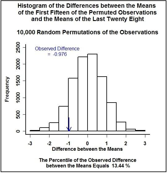
The second test is a randomization test, also called a permutation test. Phillip Good, in Permutation Tests, A Practical Guide to Resampling Methods for Testing Hypotheses, published by Springer, in 2000, provides a good description of the randomization test. A randomization test is based strictly on the data. No asymptotic results are applied. From the two data sets, a statistic is calculated. The two data sets are then merged. Then all of the permutations of the combined data sets are found and, for each permutation the value of the statistic is calculated. The value of the statistic calculated from the actual data sets is compared to the collection of the values found from all of the permutations of the data. If the statistic from the actual data sets is unusually large or small with respect to the collection of all of the possible values from the permutations, then we tend to believe that there is a difference in the processes generating the two data sets.

The statistic for our case is the difference between the mean of the destiny numbers for the first fifteen presidents and the mean of the destiny numbers for the last twenty-eight presidents. There are 43 factorial divided by the product of 15 factorial and 28 factorial permutations of the forty-three presidents destiny numbers divided into groups of fifteen and twenty-eight. That is about 152 billion permutations of the forty-three numbers. Below is a histogram of differences between the mean of the first fifteen numbers and the mean of the last twenty-eight numbers for 10,000 randomly generated permutations of the data. The arrow in the graph points to the actual observed difference.

histograms of the differences between earlier means and later means for randomly generated permutations

Obviously, calculating the statistic for 152 billion permutations is impractical (and unnecessary). The forty-three observations fall into only nine classes (the nine
destiny numbers), so a given pattern of the first fifteen numbers (which determines the pattern of the other twenty-eight numbers) will repeat over many permutations. Using R, I was able to determine that there are 149,139 unique patterns for the first fifteen numbers in the permutations.

The number 149,139 is far more tractable than 152 billion for computational purposes. However, we need to know how many permutations have each of the 149,135 patterns. The theory of multivariate hypergeometric distributions gives the number of  permutations that have any given pattern out of the 149,139 possible patterns. (See Discrete Multivariate Analysis, Theory and Practice, by Bishop, Fienberg, and Holland, published by the MIT press, in 1975, pages 450-452, as one source for information about the multivariate hypergeometric distributions.)

To demonstrate how the number of permutations for a given pattern is calculated, of our forty-three presidents, 3 have a destiny number of one, 8 have two, 2 have three, 3 have four, 4 have five, 6 have six, 5 have seven, 8 have eight, and 4 have nine.  One possible pattern of fifteen numbers out of the forty-three is 2 one’s, 5 two’s, 2 three’s, 1 four, 0 five’s, 5 sixes, 0 seven’s, 0 eight’s, and 0 nine’s. Then, looking just at the one’s (3 presidents in the full dataset and 2 in the example pattern), from Bishop, et.al., there are 3 choose 2 ( which equals ( 3 factorial ) divided by the quantity ( ( 2 factorial ) times ( ( 3 minus 2 ) factorial ) ) ), or 3, ways of choosing two of the three presidents with a destiny number of one. To explain a little further, the presidents with destiny number one are Washington, Taylor, and McKinley. The three possible ways of choosing two presidents with destiny number one are Washington and Taylor,  Washington and McKinley, and Taylor and McKinley.

There are 8 choose 5, which equals 56, ways of choosing five presidents with the two destiny number; 2 choose 2, or 1 way, of choosing two presidents with destiny number three; 3 choose 1, or 3 ways, of choosing one president with the four destiny number; 4 choose 0, or 1 way, of choosing no presidents with destiny number five; 6 choose 5, or 6 ways, of choosing five presidents with a destiny number of six; and just one way of choosing no presidents with destiny number seven; one way for no presidents with destiny number eight; and one way for no presidents with destiny number nine.

Combining the ways of choosing the destiny numbers, there are ( 3 x 56 x 1 x 3 x 1 x 6 x 1 x 1 x 1 ), which equals 3024, permutations with the pattern ( 2 – 5 – 2 – 1 – 0 – 5 – 0 – 0 – 0 ) out of the pattern ( 3 – 8 – 2 – 3 – 4 – 6 – 5 – 8 – 4 ).  Note again that the sum of the numbers 2, 5 , 2, 1, 0, 5, 0, 0, 0 equals 15, so the pattern is a pattern of fifteen out of the pattern of the forty-three actual presidents.

We are interested in the permutations for which the difference between the mean of the chosen fifteen destiny numbers and the mean of the other twenty-eight destiny numbers is less than or equal to the difference in the means found in the actual data. Algebraically, if the sum of the chosen fifteen destiny numbers is less than or equal
to the sum of the destiny numbers of the first fifteen presidents, then the difference in the means will be less than or equal to the difference in the actual data. For the presidents’ destiny numbers, the sum of the destiny numbers for the first fifteen presidents is 70, so we are interested in permutations for which the sum of the
chosen fifteen destiny numbers is less than or equal to 70.

To continue on with our pattern of fifteen given above, the sum of the destiny numbers in the pattern is ( 2 x 1 + 5 x 2 + 2 x 3 + 1 x 4 + 0 x 5 + 5 x 6 + 0 x 7 + 0 x 8 + 0 x 9 ), which equals 52. Since fifty-two is less than seventy, we would include the 3024 permutations with the pattern in our count of permutations for which the difference between the means of the two groups is less than the observed difference.

I used R to count the number of permutations with the sum of the chosen destiny numbers less than or equal to seventy. (The code I used can be found at R code.) Out of the possible 152 billion permutations, 13.69% had a destiny number sum less than or equal to seventy. So, for the randomization test, under assumptions discussed below, the p-value of the test is 0.1369, a bit smaller than the results of the rank sum tests.

Results of the Randomization Test on the Presidential Data
Number of Permutations = 152 billion
p-Value = 0.1369

The z-test

If any test is the work horse of hypothesis testing, the z-test is a good candidate. Because of the central limit theorem, for a random sample from just about any distribution, as the size of the sample increases, the distribution of the mean of the sample approaches a normal distribution. The mean of the limiting normal distribution is the same as the mean of the underlying distribution and the variance of the limiting normal distribution is the variance of the underlying distribution divided by the sample size. (For one reference, see Introduction to Mathematical Statistics, Fourth Edition, by Hogg and Craig, published by Macmillan, in 1978, pages 192-195.)

The central limit theorem applies to a single sample mean. The z-test for our case involves comparing two sample means, rather than doing inference on a single sample mean. If the means that are being compared are asymptotically normal, then, in Testing Statistical Hypotheses, Second Edition, by Lehmann, published by Wiley, in 1986, on page 204, Lehmann give the result that the difference between two independent, asymptotically normal random variables is also asymptotically normal to a normal distribution with the mean equal to the underlying mean of the difference and variance equal to the underlying variance of the difference. So, under the assumption of random selection of presidents with regard to destiny numbers, we can apply the central limit theorem to the presidents’ data.

If, for the presidents’ destiny numbers, we start by assuming that each president is equally likely to have each destiny number and that the selections of the presidents (by ballot or by the death or resignation of the previous president) are independent with regard to destiny numbers, then, the underlying distribution of the destiny number for any president would be a discrete uniform distribution that takes on the values from one to nine with constant probability equal to one divided by nine. So, for each of the individual presidents, the mean of the underlying distribution of the president’s destiny number would be five and the variance would be sixty divided by nine. (See Hogg and Craig, pages 48-49.)

To make inference about the difference between the means, we calculate the z statistic by dividing the observed difference by the square root of the variance of the difference.  Since the random trials are assumed to be independent, the variance of the difference is the sum of the variances of the two means. So, the variance of the difference of the observed means, under our assumptions of a discrete uniform distribution and random trials, is just sixty divided by nine times the sum of one divided by fifteen and one divided by twenty-eight.  The test is given in the table below.

A z-test of the Difference Between the Means of the Destiny
Numbers for the Two Time Periods
number mean standard error
Earlier Presidents 15 4.6667 0.6666
Later Presidents 28 5.6429 0.4880
Difference between the Means = -0.9762 Standard Error of the Difference = 0.8261
z = -1.1816 p-value = 0.1187

Since we are using the central limit theorem, if two sample sizes are large enough, the difference between the sample means, divided by the square root of the variance of the difference, should be distributed close to normal with mean equal to zero and variance equal to one. The sample size of fifteen is a bit small for the central limit theorem to hold, since our data has two peaks (is bimodal) in each of the two time periods. However, we will calculate the p-value just to compare the result to the other p-values we have calculated. The p-value is the area under the standard normal curve to the left of the calculated z statistic. For the presidents’ destiny numbers, the p-value is 0.1187. The calculation of the z-statistic is shown in the table.  So, for the z-test, we estimate that there is about a 12% chance of seeing a difference between the means of the destiny numbers for the two groups of presidents of the size observed or larger, if we assume random trials.

The Hypothesis Tests

Now that we have found p-values for the three methods of testing, we will state our assumptions, our hypotheses, and our conclusion.

For the rank sum test, we assume that the distribution of the destiny numbers is continuous and the distribution for the earlier presidents has the same shape as the
distribution for the later presidents. Neither assumption is met by our data. Under the null hypothesis, we assume that the two distributions are the same.

For the randomization test, we use the assumption that the observations are independent (or, at least, exchangeable), as discussed in the next section, in order to make use of the percentile of the observed difference. The test is based on the data, with no other assumptions, except that, under the null hypothesis, we assume that the underlying distribution is the same for both data sets.

For the z-test, we assume, under that null hypothesis, that the presidents’ destiny numbers are distributed uniformly and are the result of independent trials and that the sample sizes are large enough to apply the central limit theorem. The sample size of the first group of presidents is a bit small for applying the central limit theorem, given the bimodal nature of the data.

Rather than using the assumptions on which the three tests are based for three sets of hypotheses, I used a common set of hypotheses for the three tests. I chose the null hypothesis for all of the tests to be that the underlying mean destiny number for the earlier fifteen presidents is the same as the underlying mean destiny number of the later twenty-eight presidents. Our alternative hypothesis, for all of the tests, is that the underlying mean destiny number of the earlier fifteen presidents is less than the underlying mean destiny number of the later twenty-eight presidents.

Then,  the assumption of equal means behind the null hypotheses is more general than the distributional assumptions behind any of the three tests. Being more general, if we would reject the null hypotheses for each of the three tests, then we would necessarily reject the assumption that the means are equal. I have chosen to use a significance level of 10%, since the sample size for the earlier presidents is small. However our p-values vary from 0.1187 to 0.1696, all larger than the alpha level of 0.10, so we conclude that we do not have enough evidence to reject the null hypothesis of equal underlying means. We think that there is somewhere between a 12% and 17% chance of seeing a difference between the means of the size observed or of a larger (more negative) size if the underlying distributions for the destiny numbers of the two presidential groups are the same, so a difference of the size observed would occur quite often.

Discussion

For the rank sum tests, our assumptions are not met, so we do not expect to get exact results for the p-values. I suspect that the rank sum tests are quite unstable compared to the z-test and the randomization test, based on the set of rank sum tests done above and another set of rank sum tests done below.

As mentioned above, Phillip Good provides a good discussion of the history of and the assumptions behind the randomization test. According to Good, if we assume that the observations are independent (or exchangeable), we just need the assumption, under the null hypothesis, that the data for the two time periods come from the same distribution for the test to be exact (i.e., for the expected value of the p-value associated with the test to be accurate under the null hypothesis). So, if the forty-three destiny numbers represent a random sample of destiny numbers from some underlying population of destiny numbers of persons that might become president, then the p-value (13.69%) is the estimate of the probability of the time we will see a difference of the size observed or of a more negative size.

The result of the z-test compared with the randomization test agrees with what we would expect, given the that we are using the central limit theorem on data that is not normal. I will demonstrate why we would expect the z-test to give a smaller p-value than the randomization test.  We are assuming a uniform distribution for the nine possible values that the destiny numbers can equal. Since the data is uniform, the distribution of the mean of a sample from the data will be more triangular than the normal distribution. For a sample size of two, the distribution of the mean is exactly triangular and the distribution converges to the normal distribution as the sample size increases. Since the distribution of the sample mean for the uniform distribution is more triangular than the normal distribution, the height of the distribution in the tails will always be higher than the height of the normal curve, which means that the p-value for the actual distribution of the mean will be larger than what the normal curve would predict, if the z statistic is in the tail rather than the center of the distribution. In our case, the p-value for the randomization test is larger than the p-value for the z-test, as expected.

In the section Where to Start?, I made the statement that the population of interest is the population of native male citizens of this country since the country’s inception. Because I am a survey sampler, I tend to use the survey sampling approach to statistics. Under the survey sampling approach, the presidents would be a probability sample from the population, with the destiny number being a fixed number associated with each chosen president. Since the population of the country has increased dramatically over the years, and, since we only elect one president every four years, we cannot use the approach of the presidents being a random sample from the population of interest. Otherwise, we would have far more presidents from the later years than from the earlier years, which is an impossibility, given that presidents are somewhat evenly distributed over time.

On page 124, Hogg and Craig describe what constitutes a random sample from a distribution, using an approach more usual in statistics. A sample is considered random if, for the random variables measured, the random variables are mutually stochastically independent and the probability distribution functions of the random variables are all the same. So, one way out of the assumptional difficulty caused by the survey sampling approach is to assume that destiny numbers of the presidents are a random sample from an underlying distribution. Under the null hypothesis, we would assume that the destiny numbers are the result of random draws from a common underlying probability distribution that does not vary over time.

Are we justified in assuming that the destiny numbers of the presidents are the result of a random process, since becoming president does not involve a random process? The probabilistic results (the p-values) calculated above are based on the assumption that the observations are the result of a random process. My approach to this conundrum is to state the caveat that the results of the tests are the results that would apply if we knew the selection process were random. Certainly, if there is nothing to numerology and if there is not some artifact present in the birth demographics, one would have no reason to think that any president would be more likely to have a given destiny number than any other president. However, just picking out objects from a group of objects is not a random process.

I did the three types of tests out of curiosity. By the randomization test, we can say that the 13.69% chance of seeing the difference in the means of the size observed or more negative, if the underlying distributions for the two time periods are the same, is an unbiased estimate of the underlying probability under the null hypothesis.  The assumptions for the test are that the chance of a president having a given destiny number is the same for all presidents and is not affected for any given president by any other president. We make no assumption as to what the distribution looks like.

A p-value greater than or equal to 13.69%  happens quite often if the null hypothesis is true. Also, we looked at the data before deciding what to test, so we should be very conservative (e.g., look for a very small p-value) in our choice of significance level. Although the z and rank sum tests are only asymptotically exact (under the violations of the assumptions of each of the tests), the p-values for the z and rank sum tests agree quite well with the p-value for the randomization test.

Two’s and Eight’s

Stopping here would be good, but I am going to look a little closer at the data. In our observed data, the destiny numbers two and eight stand out. In the table below is a list of the proportions observed for the nine destiny numbers for the two time periods, and the average of the proportions for the two time periods.  We can see that the destiny numbers two and eight occur about twice as often as the other numbers, when we average the proportions for the two time periods. Although I have not given the tests here, there is some reason to believe, on the basis of probability, that the distribution of the two’s and eight’s is different from the distribution of the other seven destiny numbers.

Observed Proportions for the Destiny Numbers of the Presidents
– for the Earlier and Later Time Periods and for the Average of
the Two Time Periods
Destiny Number Early Presidents Later Presidents Average
1 0.13 0.04 0.08
2 0.20 0.18 0.19
3 0.13 0.00 0.07
4 0.07 0.07 0.07
5 0.07 0.11 0.09
6 0.07 0.18 0.12
7 0.00 0.18 0.09
8 0.27 0.14 0.20
9 0.07 0.11 0.09
Total 1.01 1.01 1.00

Perhaps there is something special about the numbers two and eight that causes presidents to be chosen with destiny numbers two and eight at a more constant rate, independent of time period. If we calculate p-values for the same tests that we did above, except excluding presidents with destiny numbers of two or eight, we get the results shown in the table below. We can see that the p-values are all smaller than 0.025. Doing the same hypothesis tests that we did above, except using a significance level of 0.025 and not including the presidents with destiny numbers two and eight, we reject the null hypothesis that the mean of the destiny numbers for the earlier presidents is the same as the mean of the destiny numbers for the later presidents. We accept the alternative hypothesis that the mean of the destiny numbers for the earlier time period is less than the mean for the later time period. I feel that using a level of 0.025 for the significance level for our hypotheses tests is okay, since the data sets which we are comparing are small, of size eight and nineteen. We use a conservative significance level since our hypothesis tests were based on looking at the data. Our tests and assumptions indicate that, if there is no difference between the underlying distribution of the destiny numbers for presidents who do not have a destiny number of two or eight, we estimate that we would see a difference of the size observed, or larger (more negative), less than two and one-half percent of the time.

p-Values for Tests of the Difference Between the Mean Destiny
Numbers for the Two Time Periods – for Presidents with Destiny
Number Not Equal to Two or Eight
Test p-value
Rank Sum – Snedecor and Cochran 0.0168
Rank Sum – Other Authors 0.0158
Rank Sum – R – No Continuity Correction 0.0147
Rank Sum – R – Continuity Correction 0.0157
Randomization 0.0211
z-Test 0.0207


We note that the p-values for the rank sum tests are smaller than either the randomization test or the z-test, unlike the p-values for the rank sum tests found above in our first set of hypotheses tests. For the z-test, the p-value is smaller than the p-value for the randomization test, as we would expect. The randomization test remains exact under the assumption of presidents coming to power being random trials with regard to destiny numbers.

Conclusions

So, what do we conclude? I would say that, even though we fail reject the null hypothesis that earlier presidents were not more likely than later presidents to have smaller destiny numbers when we include all of the presidents, there does seem to be a difference if we do not include the presidents with two’s and eight’s for destiny numbers. To me, there appears to be a difference between the distributions for the two time periods.  My hypotheses were not formed before I looked at the data. Instead, my hypotheses are based on the data, so the rejection of the null hypothesis for the second set of tests is suspect. In one approach to experimental work, when one observes an effect in a sample by doing exploratory analysis, one forms a set of hypotheses and takes another sample to test the hypotheses. We only have data for presidents who have served. We cannot take another sample. So, our results are suspect. As time goes by, we will have destiny numbers for future presidents and will see if the destiny numbers continue to stay high or be two’s or eight’s. We will, then, have hypotheses tests that will not be suspect. Also, we might research leaders in other countries, forming our hypotheses before looking at the leadership data, with the hypotheses based on our research here.

As to the numerology, perhaps persons with a higher destiny number are on a more complex path than those with a smaller destiny number. I do not know. I am just a student of numerology and have no training or extensive experience to make such
a conclusion. As far as the result of the research goes, I find the result interesting and suspend judgment as to what the result means.

Links

Some links to numerological sites are

http://www.astrology-numerology.com/numerology.htm

http://en.wikipedia.org/wiki/Numerology

http://www.cafeastrology.com/numerology.html#one .

These three sites give quite a bit of information about numerology, particularly the first one. At Michael McClain’s site, the destiny number is called the life path number. At the Cafe Astrology site, the destiny number is called the birth path number. A quick search on the web would give many other places to find numerological information.

Wikipedia provides basic information about the tests done here. Some links are

Rank Sum Test

Randomization Test

One Sample Location z Test and Two Sample Location t Test.

FITTING A LOG LINEAR MODEL

You can use log linear models to fit cross classified catagorical data. In fitting log linear models, the logarithm of the expected counts in the cells of the contingency table are modeled as linear combinations of parameters, where there can be parameters for interactions between dimensions in the table. I follow the approach of Bishop, Fienberg, and Holland in Discrete Multivariate Analysis: Theory and Practice, MIT Press, 1975.

Some Terminology

Some terminology is in order. An hierarchical model is a model in which, if a parameter is not in the model, then neither are the higher level interactions associated with the parameter. A complete model is a model in which none of the expected cell counts are equal to zero. An incomplete model has at least one cell where the expected cell count is zero. A saturated model is a model in which all possible parameters are fit. An unsaturated model is a model in which some of the parameters are set to zero. In Bishop, et.al., each dimension of the table is called a factor and only hierarchical models are fit, which can be either complete (chapter 3) or incomplete (chapter 5). The parameters are modeled such that the sum over the indices for a given parameter and factor equals zero (except of course the first parameter, ‘u’).

The Saturated Model

Following the notation of Bishop, et.al., for a three dimensional contingency table, the saturated model would be

log(mijk) = u + u1(i) + u2(j) + u3(k) + u12(ij) + u13(ik) + u23(jk) + u123(ijk),

where ‘mijk‘ is the expected cell count in cell (i,j,k).

Say that we have two levels for each of the three factors. Then, the indices associated with the factors, ‘i’, ‘j’, and ‘k’, can each take on either the value ‘1’ or the value ‘2’. For this example, since there are only two levels for each factor and the parameters sum to zero over each index, specifying a parameter (say u12(11)) for a given set of factors (here, the interaction between factors 1 and 2) means that the other parameters for the given set of factors (in this case, u12(12), u12(21), and u12(22)) are specified too. It follows that, for this example, there are eight unique parameters in the saturated model, one for each factor combination (‘1′,’2′,’3′,’12’,’13’,’23’, and ‘123’) and one for the unindexed parameter ‘u’.

There are eight possible unique sets of values for the three indices ‘i’, ‘j’, and ‘k’ ((1,1,1), (1,1,2), … , (2,2,2)), representing the eight cells in the table. If ‘i’, ‘j’ and ‘k’ are given, so are ‘ij’, ‘ik’, ‘jk’, and ‘ijk’. This means that the eight estimated cell counts are uniquely defined. In the model, there are eight unique parameters, and there are eight cell counts. It follows that the saturated model fits the data exactly – the estimates of the expected cell counts are the cell counts themselves.

An Unsaturated Models

The saturated model is not usually of interest. For unsaturated models, in order to estimate the expected cell counts, Bishop, et.al., model the data in the cells as either independent Poisson variables or as variables from a single multinomial distribution, and find minimal sufficient statistics for the expected cell counts based on either of the two probability distributions. Under the assumptions, the minimal sufficient statistics are the same for either distribution.

An example of an unsaturated model based on the saturated model given above is

log(mijk) = u + u1(i) + u2(j) + u3(k) + u13(ik) + u23(jk) .

Here, the main effects of each of the factors are included (In Bishop, et.al., the main effects are always included. According to Bishop, et.al., such models are called comprehensive models.) The only higher order effects which are still present are the interactions between the first and third factors and between the second and third factors. Note that, since the u12(ij) term is not in the model, the term u123(ijk) cannot be either if the model is to be heirarchical. For an unsaturated model, Bishop, et.al., give an algorithm to find maximum likelihood estimators for the expected cell counts using the minimal sufficient statistics of the given unsaturated model. The maximum likelihood estimators do not depend on which probability distribution is used. (The results that I give below are based on an R function that I wrote to apply the algorithm.)

Evaluating an Unsaturated Model

Bishop, et.al., follow the method of evaluating the fit of an unsaturated model by using the chi squared distribution of either

Χ2 = Σ ( xi – ̂mi )2 / ̂mi

or

G2 = Σ -2 xi log( ̂mi / xi ) ,

where xi is the cell count in cell i and ̂mi is the estimated expected cell count in cell i, and i goes over all of the cells in the array for which ̂mi does not equal zero. Χ2 then is the Pearson chi square statistic and G 2 is minus twice the log likelihood ratio. Χ2 and G2 are goodness of fit statistics. A model fits if the chi square statistic falls in the ‘normal’ range for a chi square of the appropriate degrees of freedom. Bishop, et.al., only look at the right tail of the appropriate chi square distribution, accepting models that fit the data too well. Among the models considered, the most parsimonious model that still fits the data is accepted.

Fitting a Loglinear Model to the Deficit by Political Party Data Set

To demonstrate fitting a log linear model, I will use the data in the Deficit by Political Party Data Set. The deficits (surpluses) as a percentage of the gross domestic product are classed into four classes and the political parties in control are associated with the deficit (surplus) of the following year. The political parties go from 1946 to 2007 and the deficits (surpluses) as a percentage of gross domestic product go from 1947 to 2008. The data array is given below.

On Budget Deficit (-) (Surplus (+)) per GDPby the Controlling Political Parties

of the Presidency, Senate, and HousePolitical Parties Lagged One Year

President Senate House (-6.2,-4] (-4,-2] (-2,0] (0,4.2]
D D D 0 7 10 2
R
R D
R 0 1 4 3
R D D 5 8 5 3
R 1 1 0 0
R D 4 2 2 0
R 1 3 0 0

Since the interaction between the deficit (surplus) is of interest and the senate and house seem to be interrelated, the following models were fit.

1: log(mijk) = u + u1 + u2 + u3 + u4 + u12 + u13 + u14+ u23 + u24 + u34

2: log(mijk) = u + u1 + u2 + u3 + u4 + u12 + u13 + u14 + u34

3: log(mijk) = u + u1 + u2 + u3 + u4 + u12 + u13 + u14

4: log(mijk) = u + u1 + u2 + u3 + u4 + u12 + u14 + u34

5: log(mijk) = u + u1 + u2 + u3 + u4 + u12 + u14

6: log(mijk) = u + u1 + u2 + u3 + u4

The subscript 1 refers to the deficit (surplus) classes and takes on 4 levels, the subscript 2 refers to the party of the president and takes on 2 levels, the subscipt 3 refers to the party controlling the senate and takes on 2 levels, and the subscript 4 refers to the party controlling the house and takes on 2 levels. The G2 values found by fitting the six models, as well as the degrees of freedom for and the p-values from the chi squared tests, are given in the table below.

Model G2 df p-value
1: 9.14 5 0.1036
2: 10.83 7 0.1460
3: 16.79 8 0.0324
4: 12.19 10 0.2725
5: 17.47 11 0.0947
6: 37.66 17 0.0027

From the table, models 1, 2, 4, and 5 all fit the data. Chi squared tests to compare the models
are given in the table below.

Models Difference

in G2

Difference

in df

p-value
1: & 2: 1.69 2 0.4296
2: & 4: 1.36 3 0.7149
4: & 5: 5.28 1 0.0216

There is little difference between models 1 and 2, and 2 and 4, so out of models 1, 2, and 4, the most parsimonius model is model 4. Model 5 is more parsimonious than model 4, however the test of the difference between the models shows a significant difference from the central chi squared distribution with 1 degree of freedom. It appears that something is lost when going from model 4 to model 5. We conclude that model 4 is the best model and that the interaction between the house and senate, the interaction between the deficit level and the party of the president, and the interaction between the deficit level and the party controlling the house are important and that the interaction between the party controlling the senate and the deficit level is not.

Below is a table of the fitted cells, normalized to sum to 100 across rows, for model 4.

Estimated Expected Cell Counts Normalized by RowUsing Model 4 for the On Budget Deficit (-) (Surplus (+)) per GDP

by the Controlling Political Parties

of the Presidency, Senate, and HousePolitical Parties Lagged One Year

Rows Sum to 100 Except for Rounding

President Senate House (-6.2,-4] (-4,-2] (-2,0] (0,4.2]
D D D 00 30 55 15
R
R D
R 00 29 42 29
R D D 33 40 21 07
R 26 42 17 15
R D 33 40 21 07
R 26 42 17 15

Democratic presidents perform much better than Republican presidents. With regard to Republican presidents, there is no difference between Democratic and Republican senates. Republican houses perform somewhat better than Democratic houses under both Democratic and Republican presidencies.

CHERNOFF FACES IN R

Chernoff faces is a technique from multivariate analysis. The Chernoff faces technique was developed by Herman Chernoff and was presented in a paper in 1973 in the Journal of the American Statistical Association. Chernoff faces provide an intuitive way of looking at variation within a data set where the data is in a matrix of rows and columns (for example, a two way contingency tables).  A different face is created from each row in the data set. The differences between the faces are based on the columns of the data set. Each column is associated with one part of a facial expression (the first column is associated with the height of the face, the second with the width of the face, etc.). Chernoff designed the method for up to 18 facial components.  The faces() function in the TeachingDemos package of R uses 15 facial components, which were used here.

Components of the Faces

From  help page for the function faces(), the fifteen components in R are the height of the face, width of the face, shape of the face, height of the mouth, width of the mouth, curve of the smile, height of the eyes, width of the eyes, height of the hair, width of the hair, styling of the hair, height of the nose, width of the nose, width of the ears, and height of the ears.  If the number of columns in the matrix is less than 15, the function will cycle back through columns until 15 columns are used.  One way around the problem is to put a constant value in the excess columns.  In what is presented here, cycling was done.

Description of the Data

The Chernoff faces below were generated using the function faces() in the TeachingDemos package of R and are plots of the differences between facial expressions in the The Astrofaces Data Set. The Astrofaces Data Set was created from the pictures at the website, http://www.astrofaces.com, where an astrological group has gathered photographs from over 4700 persons, along with the placement of the Sun, Moon, and Ascendant for each person. In the spring of 2002, I went though the photographs and classed the faces as to whether the face had an open smile, a closed smile, an open mouthed neutral expression, a closed mouth neutral expression, an open frown, or a closed frown. For each person, I recorded the expression and the elements of the Sun, Moon, and Ascendant (the elements in astrology are air, earth, fire, and water). There were 2015 photographs in the data set at the time.

I have used a variety of techniques over the years to try to find a relationship between the elements of the Sun, Moon, and Ascendant and the expressions in the photographs, with little to show for my effort. So far, correspondence analysis has given the best results. (That said, I encourage anyone who thinks that there is nothing to astrology to visit the Astrofaces website and look at groups of photos.)  Few persons had open frowns.  The expressions on the persons at the Astrofaces website are not to be confused with the facial expressions of the Chernoff faces.

The input file for the faces() function in R was a table of normalized counts with astrological elements in the rows and facial expressions in the columns. In the four rows were counts of the number within the element with each of the six facial expressions divided by the total number of persons in the element. The plots are for the Sun, Moon, and Ascendant data, each done separately. In the post for astrological researchers posted earlier on this site, there is a plot of the combined data.

The Sun Faces

sun.faces

The first column – open smiles – controls height of face, height of eyes and width of nose; the second – closed smiles – width of face, width of eyes and width of ears; the third – open neutrals – shape of face, height of hair, height of ears; the fourth – closed neutrals – height of mouth and width of hair; the fifth – open frowns – width of mouth and styling of hair; and the sixth – closed frown – curve of smile and height of nose.

In the Sun plot, we can see that the air and fire faces have similar sizes and shapes but different expressions, so air and fire are somewhat similar with regard to the first three columns (open smile, closed smile,  and open neutral), but not with regard to the last three columns (closed neutral, open frown, and closed frown).  Water and earth have the same shape- so are similar with respect to open neutrals, but are different sizes – so are different with respect to open and closed smiles.  Other than the open neutrals, the two elements are different.

The raw table of counts for the Sun data is given below.  The zero under open frowns for the water element causes a degeneracy in the water face.

Counts for the Sun Placements
Open Smile Closed Smile Open Neutral Closed Neutral Open Frown Closed Frown
Air 104 31 32 100 3 26
Earth 97 35 40 104 1 28
Fire 108 32 31 101 2 29
Water 107 41 36 93 0 34

The Moon and Ascendant Faces

The Chernoff faces for the Moon and Ascendant are plotted below.

moon.faces

asc.faces

In the Moon and Ascendant plots, we can follow the same procedure as with the Sun to evaluate the expressions.

Conclusions

We can see from the plots for the Sun, Moon, and Ascendant that the faces tell us something intuitive about the differences between the four astrological elements with regard to the six facial expression classes in the Astrofaces dataset. Looking between plots, we can also see similarities across the Sun, Moon, and Ascendant for differing elements.

FOR ASTROLOGICAL RESEARCHERS:

Analysis of Count Data – Clustering – Hypotheses Testing – Plotting

In this Plot You can see how Plots can Convey Information about the Relationship between Placements:

faces.com data - proportions by element

The data for this plot comes from www.astrofaces.com. Several years ago, I went through the photos at the Astrofaces website and classed the photos by expression and by the element of the Sun, Moon, and Ascendant. The plot is of the classed data. From the plot, Fire has fewer Closed Smiles and Air has fewer Closed Frowns, otherwise, there is not much difference between the expressions.

Chernoff Faces show You Differences between Rows of data across Columns within a matrix by using Facial Expressions: (not to be confused with the expressions in the data set)

faces.com data - Chernoff faces

This plot is based on the data on expressions from www.astrofaces.com. (One reason I included this plot is because the expressions on the faces seem to have an astrological take – pure coincidence.)  You can get Chernoff faces for your data at Vanward Statistics.

I can do Multiple Correspondence Plots for you to show Clustering for Categorical Variables:

faces.com data - Multiple Correspondence Analysis


For the Facial Expression data, the plot shows that different element / point combinations are associated with different facial expressions.

I can Model and Test Hypotheses for Astrological Questions for You, Using the Swiss Ephemeris:

In an article in Today’s Astrologer, by Cowell Jeffery, Volume 73, Number 13, Page 23, Mr. Jeffery hypothesized that if an aspect between two planets is present at birth, the same planets are likely to be in aspect at death. Mr. Jeffery used the Elizabethans Henry VIII, Queen Elizabeth I, Robert Devereux, William Cecil, and Mary Stuart, for an example. I modeled the problem for the major aspects, using an orb of 8 degrees for all of the planets and the Sun and an orb of 12 degrees for the Moon, where the planets are the eight usual planets (including Pluto, excluding Chiron).

I estimated the expected number of aspects for each point combination (there are 42 of them – I excluded aspects between Uranus, Neptune, and Pluto) – if the births and deaths occured randomly over the time period from the last decade of the 15th century to the end of the 16th century. I, also, found estimates of the variances and covariances between the point combinations. Different planetary combinations have different expected numbers of aspects and different variances and covariances. I, then, estimated the number of matches to expect, and the variance of the estimate of the number of matches to expect, if the count at birth is independent of the count at death. Using the results, I was able to test if the five Elizabethans had unusually high numbers of matches. The difference was positive but not significantly different from zero. One would need a very strong effect for the p-value of a test to be very small given a sample of five. The number seen for the Elizabethans is larger than the estimated expected count, which is encouraging, but too small to be considered significantly different from zero.

I did not tried to model seasonal, locational, or time of day patterns for the Elizabethans, which would affect the results. This is an area of ongoing research for me. Different parts of the world (or US for the US) have differing distributions of births  (on which planetary placements depend) over the year, so currently I am only looking at data in localized places (in Iowa). Also, I now used the distributions of births in a data set and the seasonal patterns of births from data given to me by the State of Iowa to estimate expected counts and the covariances of the counts. I use an empirical density function generated from the birth observations to do the estimations. Since the data I am using does not have times of birth, I have not tried to account for time of day.

Links to a Vulcan Cent Ephemeris:

I have been experimenting with points I call Vulcan and Cent. The longitude of Vulcan is the average over the shortest arc of the longitudes of Ceres, Vesta, Pallas, and Juno. The declination of the point is found using the longitude and the average of the latitudes of the four. Cent is the closer midpoint of the Centaurs Chiron and Pholus – the only two civil Centaurs in Greek mythology. An ephemeris from 1900 to 2050 for the two points can be found in two files, one in rich text format and the other in pdf format. The original files I put up contained an error. The files now should be correct. I did not realize ‘abs’ was an integer function in C in computing the original function. I used the Swiss Ephemeris for the placements in longitude and latitude of Ceres, Vesta, Pallas, Juno, Chiron, and Pholus.

Here is the link: https://1drv.ms/b/s!AgjNmjy3BpFDmBBTiEPHc3qPr9ls

Earlier in this blog, there is a description of doing regression analysis with autocorrelated errors. The point Vulcan jumps 90 or 180 degrees from time to time and I look at divorce numbers (in Iowa) as related to Vulcan jumps.

For the Basics of Statistical Theory:

Gator Talk Slides
Here I have provided you with a introduction to some statistical results. Click on the link  above to see the power point slides that I used for a talk to Alphee Lavoie’s AstroInvestigators. The slides cover the Normal and Chi Square distributions, plus the Central Limit Theorem, which are applied to some Astrological Data.

Sometimes, You might Find that just Plotting Astronomical Information is Interesting:

const-trop2.2018


Using sidereal longitudinal limits for the constellations of the zodiac, I plotted
the placements of the zero degree points of the tropical signs within the constellations.

FOR ENERGY RESEARCHERS:

Sampling Plans – Analysis of Samples – Modeling – Graphing

Below are graphs of altitudes and azimuths of the sun, for differing times of the year, for Stratford, Iowa, which give you an example of the capability of R for use in planning solar installations:

altitude-azimuth

You can download the R function – which plots individual altitude / azimuth graphs, for any place in the world, for any time of year. You can download the file here: angle.plot.

If you call the function ‘angle.plot’, to run the program with default values, you would type ‘angle.plot()’ at the R prompt. To change the defaults, you can manually change the defaults when the function is run; for example, angle.plot(loc=”Hull, MA”,  mo=8,  da=28,  ye=2013,  tz=4,  la=42.3019,  lo=70.9083).

function(loc="Stratford, Iowa", mo=1, da=1, ye=2010, tz=6, 
la=42.26782, lo=93.92097) {

#  The algorithms for this function come from Astrological Algorithms, 2nd ed.,
#  by Jean Meeus, published in 1998, by Willmann-Bell, Inc.  The page 
#  references are to Meeus. 
   
#  check the inputs

      cat("the location entered is ", loc, "\n")
      cat("the date entered is ", mo, "/", da, "/", ye, "\n")
      cat("the time zone is ", tz, " hours from UT", "\n")
      cat("the latitude is ", la, "degrees and the longitude is ", lo, 
          " degrees\n", "\n")
      cat("  if not correct then enter n ")
      tes <- readline()
      if(tes == "n") stop("change the value of the arguments")
	
#
#  define tosid - the solar to sidereal time correction factor (p. 408)
#
      tosid <- 366.2422 / 365.2422	
#
#  create local - the local dynamical times for the plot - in degrees 
#  (see chapter 10 in Meeus)
#
      local <- seq(-150, 150, by = .02)	
#
#  find jd - the julian days for the local dynamical times - in days (p. 61)
#
  if(mo == 1 | mo == 2) { 
    mo <- mo + 12
    ye <- ye - 1
   }
  ga <- floor(ye/100 + 1e-008)
  gb <- 2 - ga + floor(ga/4 + 1e-008)
  jd <- (floor(365.25 * (ye + 4716)) + floor(30.6001 * (mo + 1)) +
       (da +.5) + gb - 1524.5) + local/(15 * 24) + lo/(15 * 24)
     
#
#   find T - the increment from January 1, 2000 at noon TD
 
#            for the local dynamical times - in centuries (p. 163)
#
     T <- (jd - 2451545)/36525
     Tsq <- T^2
#
#   find L0 - the mean longitudes of the sun - in radians (p. 163)
#
           L0 <- (280.46646 + 36000.76983 * T + 0.0003032 * Tsq)/180 * pi
#
#   find M - the mean anomolies of the sun - in radians (p. 163)
#
      M <- (357.52911 + 35999.05029 * T - 0.0001537 * Tsq)/180 * pi
#
#   find C - the sun's equations of the center - in radians (p. 164)
#
      C <- (1.914602 - 0.004817 * T - 1.4e-005 * Tsq) * sin(M)
      C <- C + (0.019993 - 0.000101 * T) * sin(2 * M)
      C <- (C + 0.000289 * sin(3 * M))/180 * pi
#
#   find omega - the correction factors for finding the apparent longitudes
#                of the sun - in radians (p. 164)
#
      omega <- (125.04 - 1934.136 * T)/180 * pi 

#   find lambda - the apparent longitudes of the sun - in radians (p. 164)
#
      lambda <- L0 + C - (0.005689999999999997 + 
                          0.004779999999999999 * sin(omega))/180 * pi
#
#   find epsilon - the apparent obliquities of the ecliptic - in radians 
#   (pp. 144-147)
#
      Lprime <- (218.3165 + 481267.8813*T) / 180 * pi
      deltapsi <- (-17.2*sin(omega) - 1.32*sin(2*L0) - 
                   0.23*sin(2*Lprime) + 0.21*sin(2*omega))/3600
      deltaep <- (9.2*cos(omega) + 0.57*cos(2*L0) + 0.10*cos(2*Lprime) - 
                  0.09*cos(2*omega))/3600
      epsilon <- (23.439291111 - 0.013004167 * T - 1.638889e-07 * Tsq + 
                  5.036111111e-07 * Tsq * T + deltaep)/180 * pi
#   find alpha - the apparent right ascensions of the sun - in radians (p. 165)
#
      alpha <- atan2(cos(epsilon) * sin(lambda), cos(lambda)) 
#
#   find delta - the apparent declinations of the sun - in radians (p. 165)
#
      delta <- asin(sin(epsilon) * sin(lambda))	
#
#   find e - the eccentricities of the earth's orbit - unitless (p. 163)
#
      e <- 0.016708634 - 0.000042037 * T - 0.0000001267 * Tsq 
#
#   find deltaT - the factors to convert to mean times from dynamical times
#                 and vice versa (referenced to solar time) - 
#                 in degrees (p. 78)
 
#
      deltaT <- (65 + 88*T + 25.3*T^2)/3600*15 
#
#   find jd_UT - the julian day for 0h UT on the day of the plot - in days
#   and T_UT - the increment from 1/1/2000 noon UT to jd_UT - in centuries  
#   (p. 87)
# 
      jd_UT <- jd[local==0] - lo/(15 * 24) - .5
      T_UT <- (jd_UT -2451545)/36525
#
#   find THETA0 - the mean sidereal time of the point due south at Greenwich
#                 at 0h UT on the day of the plot - in radians (p. 87)
#
      THETA0 <- 100.46061837 + 36000.770053608*T_UT 
      THETA0 <- (THETA0 + 0.000387933*T_UT^2 - (T_UT^3)/38710000)/180*pi
#
#   find theta - the apparent sidereal times of the points due south at 
#                the location for the local dynamical times - 
#                in radians (p. 88)
#
      theta0 <- THETA0 + (lo + local + 180 + deltaT)*tosid/180*pi
      theta <- (theta0 - lo/180*pi) + (deltapsi*cos(epsilon))/180*pi
#
#   find H - the hour angles of the sun for the local dynamical times - 
#            in radians (referenced to sidereal time) (p. 92)
#
       H <- (theta - alpha)%%(2*pi)
       H[H>pi] <- H[H>pi]-2*pi	
#
#   convert the geographical latitude to radians
#
      phi 
#
#   find the altitudes and azimuths of the sun - in degrees (p. 93)
# 
     azimuth <- atan2(sin(H), (cos(H) * sin(phi) - tan(delta) * 
                      cos(phi)))* 180 / pi
     altitude <- asin(sin(phi) * sin(delta) + 
                      cos(phi) * cos(delta) * cos(H)) * 180 / pi
#
#   convert local - the local dynamical times - to Time - the civil times - 
#   in solar hours (p. 77)
#
      Time <- (local - deltaT + 180 + lo)/15 - tz
#
#   make the plot
#
      par(mar = c(6, 6, 7, 7) + 0.1, font.main=1)
      plot(Time[altitude>=0], altitude[altitude>=0], axes = F, type = "l",
 
      lty = 1, xlab="", ylab = "", 
      xaxs = "r", xaxt = "n", yaxt = "n", yaxs = "r", ylim = c(-10, 90),
      xlim = c(4, 22), col=2)
      axis(1, at = c(4, 6, 8, 10, 12, 14, 16, 18, 20, 22), labels = c("4AM",
           "6AM", "8AM", "10AM", "12PM", "2PM", "4PM", "6PM", "8PM",
           "10PM"), tck = 1)
      axis(2, at = c(-10, 0, 10, 20, 30, 40, 50, 60, 70, 80, 90), labels = c(
           "-10", "0", "10", "20", "30", "40", "50", "60", "70", "80",
           "90"), tck = 1, adj = 1)
      legend(3.4,90, c("Altitude", "Azimuth"), lty=1,
           col = 2:3, bg="white")
      mtext(side = 2, line = 3, "Altitude of the Sun (degrees)")
      par(new = "T")
      plot(Time[altitude>=0], azimuth[altitude>=0], axes = F, type = "l", 
          lty = 1,
          xaxt = "n", ylim = c(-140, 140), xlim = c(4, 22), ylab = "", 
          xlab="", col=3)
      axis(side = 4, at = c(-120, -90, -60, -30, 0, 30, 60, 90, 120), labels
           = c("120 E", "90 E", "60 E", "30 E", "0", "30 W", "60 W", "90 W",
           "120 W"), adj = 0, cex.axis=.7)
      mtext(side = 4, line = 3, "Azimuth of the Sun (degrees)", srt=270)
      mtext(side = 3, line = 2, paste(loc, "\n \n", "Latitude =", 
            round(la, 5), "  Longitude =", round(lo, dig = 5), " "))
      mtext(side = 1, line = 3, "Time")
      box()
#
#   print out some variables
#
      for( i in 1:(length(local)-1) ) {
            if (altitude[i+1] >= 0 & altitude[i] < 0) {kr              
            if (altitude[i+1] >= altitude[i]) {kn 
            if (altitude[i+1] < 0 & altitude[i] >= 0) {ks 
            }
      cat(
      "L0 ",(L0[c(kr,kn,ks)]*180/pi)%%360,"\n",
      "M ",(M[c(kr,kn,ks)]*180/pi)%%360,"\n",
      "C ",(C[c(kr,kn,ks)]*180/pi)%%360,"\n",
      "omega ",(omega[c(kr,kn,ks)]*180/pi)%%360,"\n",
      "lambda ",(lambda[c(kr,kn,ks)]*180/pi)%%360,"\n",
      "epsilon ",(epsilon[c(kr,kn,ks)]*180/pi)%%360,"\n",
      "alpha ",(alpha[c(kr,kn,ks)]*180/pi/15)%%24,"\n",
      "delta ",delta[c(kr,kn,ks)]*180/pi,"\n",
      "e ",e[c(kr,kn,ks)],"\n",
      "deltaT ",(deltaT[c(kr,kn,ks)]*180/pi/15)%%24,"\n",
      "THETA0 ",(THETA0*180/pi/15)%%24,"\n",
      "theta0 ",(theta0[c(kr,kn,ks)]*180/pi/15)%%24,"\n",
      "theta ",(theta[c(kr,kn,ks)]*180/pi/15)%%24,"\n",
      "H ",(H[c(kr,kn,ks)]*180/pi/15),"\n",
      "azimuth ",azimuth[c(kr,kn,ks)],"\n",
      "altitude ",altitude[c(kr,kn,ks)],"\n",
      "Time ", Time[c(kr,kn,ks)],"\n",
      "rise ",kr,"noon ",kn,"set ",ks,"\n")
}

Some Tools for Politicians – Researchers – Pundits

Word clouds tell you what people are saying about candidates:

You can see that tweets containing Hillary or Clinton and Bernie or Sanders have more words than tweets containing just Cruz or just Trump.  Tweets are centered on Indiana, which was just having their primary.  Each word cloud was based on 100 tweets.

Word clouds of tweets containing Hillary, Clinton, Bernie, Sanders, Cruz, and Trump

You can use Box plots to provide visual information about a Data Set:

For example, You might find it is Useful to know How the different Mixes of Political Parties performed with respect to the Budget Deficit, using the Majority Party of the House and Senate and the Political Party of the President.

Box plots of deficit / surplus as a percentage if GDP by party of president, senate, and house

Bar graphs compare categories:

Comparing the different Tools governments use to Raise Money might be of interest to you for setting or evaluating policy on taxes.

iowa-2009 taxes by class

Principal component plots show how numeric data clusters:

You can see from the plot that the parties of the Senate and House cluster together – Republican  Houses and Senates are similar and Democratic Houses and Senates are similar – and the  party of the President clusters with the Budget Deficit. You could find this information very useful.  These plots do not include the Obama years or the years of WWII.

Principal component plots show how numeric data clusters

Multiple correspondence plots show how categorical data clusters:

Multiple correspondence analysis plots of deficit / surplus as a percentage if GDP by party of president, senate, and house

You can see that the House and Senate cluster together for both Republicans and Democrats while Democratic presidents cluster with small deficits than Republican presidents. This might be of interest for your campaign or analysis.

Log linear modeling allows comparisons between classes:

Expected Cell Counts Normalized to Percentages by Row
For the On Budget Deficit (-) (Surplus (+)) per GDP
by the Controlling Political Parties
of the Presidency, Senate, and House
Budget Deficit from 1947 to 2008Political Parties Lagged One Year
Rows Sum to 100 Except for Rounding
President Senate House (-6.2,4] (-4,-2] (-2,0] (0,4.2]
D D D 0% 30% 55% 15%
R
R D
R 0% 29% 42% 29%
R D D 33% 40% 21% 7%
R 26% 42% 17% 15%
R D 33% 40% 21% 7%
R 26% 42% 17% 15%

In the table, each row is the combination of the  Presidential, Senate, and House parties. You find in the rows the log linear modeled percentage of years in which the President, Senate, and House combination falls in each Budget Deficit class. The Party of the Senate does not affect the outcome and the Parties of the President and House do – Republican Houses do a bit better –  Democratic Presidents do much better – which might be of interest to you.

Odds ratios can be used to compare parties:

Iowa 2013 Legislature
Odds Legislator is Male
House Senate
Democrats 3 : 2 10 : 3
Republicans 16 : 2 10 : 2

You could be interested in the odds a legislator is a male, by party.
For both the House and Senate in Iowa, Democrats have lower odds of being male than Republicans. Depending on your political philosophy, this could be bad or good.

Box Plots: A Political Example

BOX PLOTS

Box plots are used to provide information to you about the sizes of a variable in a data set. In the example below, the sizes of the variable – on budget deficit as a percentage of Gross Domestic Product – are compared for differing values of a second variable, a categorical variable describing the controlling political parties of the President, Senate, and House of Representatives. The heavy horizontal line in each box is plotted at the median value for the data group. The top of the box is plotted at the 75th percentile while the bottom of the box is plotted at the 25th percentile. The top and bottom whiskers end at the most extreme values of the points not calculated to be outliers. The circles represent points calculated to be outliers.

The data is from a deficit by political party data set. The deficit by political party data set contains data on the on balance deficits as a percent of the gross domestic product for the years 1940 to 2015, and the political parties controlling the presidency, the senate, and the house for the years 1939 to 2014. The data for the deficit and the gross domestic product are from the Office of Management and Budget and can be found at http://www.whitehouse.gov/omb/budget/Historicals (except the first 8 values for the deficit data, which were from a series published earlier). Before 1978, the budget year ran from July 1st to June 30th. From 1978 onward, the budget year ran from October 1st to September 31st. The tables contain a one quarter correction between the years 1977 and 1978, which I have ignored. The year with which the deficit and gross domestic product are associated is the year at the end of the budget year for which the deficit and gross domestic product are calculated.

For 1940 to 2011, the data for the controlling political parties of the president, senate, and house were taken from the website of Dave Manuel,
http://www.davemanuel.com/history-of-deficits-and-surpluses-in-the-united-states.php
, a good resource on the history of the deficit.  The last three years were taken from the website https://en.wikipedia.org/wiki/United_States_Presidents_and_control_of_Congress

We look at the size of the deficit (-) / surplus (+) using the political affiliations of the President and the controlling parties of the Senate and the House of Representatives. Below are two sets of box plots, one set for the full number of years in the data set and one set for a reduced number of years. Since the budget is created in the year before the budget is in effect, the deficit (-) / surplus (+) percentages are associated with the political parties in power the year before the end of budget year.

Box plots of deficit / surplus as a percentage if GDP by party of president, senate, and house

The first set of box plots are for the years 1940 to 2015 with regard to the budgets and for the years 1939 to 2014 with regard to the party affiliations. We can see in the first set of box plots that in the years of a Democratic President, House, and Senate, there were some very large deficits. These large deficits occurred during World War II. The large deficit under a Republican President and Democratic Senate and House was in 2009, which budget was associated with the last year of the G. W. Bush presidency. The large surplus in the years of a Democratic President and a Republican Senate and House was in the year 1948, when Truman was president.

The second set of box plots are for the years 1947 to 2015 with regard to the budgets and for the years 1946 to 2014 with regard to the party affiliations. With the years of extreme deficits removed, there is a clearer picture of how the differing party combinations perform in more normal years.  The rather large deficits under the Democrats controlling all bodies were under Obama in his first term, as were the four deficits from 2012 to 2015, when Obama was president, the Democrats controlled the Senate, and the Republicans controlled the House.  Obama inherited a dangerous economic situation and got us through the economic turmoil, but in the process, Obama was running quite large deficits.

The data is here:

comb.party.39to14        defsur.40to15
“1939” “DDD”             “1940” “-3.59917”
“1940” “DDD”             “1941” “-4.90272”
“1941” “DDD”             “1942” “-14.78378”
“1942” “DDD”             “1943” “-30.83472”
“1943” “DDD”             “1944” “-23.29589”
“1944” “DDD”             “1945” “-22.00542”
“1945” “DDD”             “1946” “-7.62084”
“1946” “DDD”             “1947” “1.22684”
“1947” “DRR”             “1948” “4.0015243902439”
“1948” “DRR”             “1949” “-0.252890173410405”
“1949” “DDD”             “1950” “-1.68458781362007”
“1950” “DDD”             “1951” “1.31337813072694”
“1951” “DDD”             “1952” “-0.951048951048951”
“1952” “DDD”             “1953” “-2.16993464052288”
“1953” “RRD”             “1954” “-0.722207892700542”
“1954” “RRD”             “1955” “-1.00737100737101”
“1955” “RDD”             “1956” “0.569476082004556”
“1956” “RDD”             “1957” “0.560103403705299”
“1957” “RDD”             “1958” “-0.695762175838077”
“1958” “RDD”             “1959” “-2.39319620253165”
“1959” “RDD”             “1960” “0.0934404784152495”
“1960” “RDD”             “1961” “-0.693937180423667”
“1961” “DDD”             “1962” “-1.00528199011757”
“1962” “DDD”             “1963” “-0.645890521556596”
“1963” “DDD”             “1964” “-0.980540051289787”
“1964” “DDD”             “1965” “-0.225130153369917”
“1965” “DDD”             “1966” “-0.396470136846144”
“1966” “DDD”             “1967” “-1.50322118826056”
“1967” “DDD”             “1968” “-3.08017346825309”
“1968” “DDD”             “1969” “-0.0509009467576097”
“1969” “RDD”             “1970” “-0.829282241921647”
“1970” “RDD”             “1971” “-2.33181452693648”
“1971” “RDD”             “1972” “-2.14022140221402”
“1972” “RDD”             “1973” “-1.12094395280236”
“1973” “RDD”             “1974” “-0.484457004440856”
“1974” “RDD”             “1975” “-3.35899664721222”
“1975” “RDD”             “1976” “-3.87644528849913”
“1976” “RDD”             “1977” “-2.46006704791954”
“1977” “DDD”             “1978” “-2.43174435958213”
“1978” “DDD”             “1979” “-1.5408560311284”
“1979” “DDD”             “1980” “-2.61370137299771”
“1980” “DDD”             “1981” “-2.35470303339281”
“1981” “RRD”             “1982” “-3.63921663297022”
“1982” “RRD”             “1983” “-5.86540905368388”
“1983” “RRD”             “1984” “-4.68781623153208”
“1984” “RRD”             “1985” “-5.18686774072686”
“1985” “RRD”             “1986” “-5.24459337316197”
“1986” “RRD”             “1987” “-3.52161274807085”
“1987” “RDD”             “1988” “-3.73028651238579”
“1988” “RDD”             “1989” “-3.68761220825853”
“1989” “RDD”             “1990” “-4.693470395293”
“1990” “RDD”             “1991” “-5.26014304184874”
“1991” “RDD”             “1992” “-5.29006791303402”
“1992” “RDD”             “1993” “-4.42096278090921”
“1993” “DDD”             “1994” “-3.59554308260858”
“1994” “DDD”             “1995” “-2.9854682596197”
“1995” “DRR”             “1996” “-2.18091573392828”
“1996” “DRR”             “1997” “-1.21652206714447”
“1997” “DRR”             “1998” “-0.333899137892527”
“1998” “DRR”             “1999” “0.0199779191420009”
“1999” “DRR”             “2000” “0.851382511184249”
“2000” “DRR”             “2001” “-0.306684588152888”
“2001” “RDR”             “2002” “-2.91811085879249”
“2002” “RDR”             “2003” “-4.75097949242879”
“2003” “RRR”             “2004” “-4.69864169548169”
“2004” “RRR”             “2005” “-3.82965187098977”
“2005” “RRR”             “2006” “-3.17507873756823”
“2006” “RRR”             “2007” “-2.38918096195603”
“2007” “RDD”             “2008” “-4.3504785661994”
“2008” “RDD”             “2009” “-10.7509053320938”
“2009” “DDD”             “2010” “-9.26715545494476”
“2010” “DDD”             “2011” “-8.88732833957553”
“2011” “DDR”             “2012” “-7.16843865428771”
“2012” “DDR”             “2013” “-4.35807759681418”
“2013” “DDR”             “2014” “-2.99182355166293”
“2014” “DDR”             “2015” “-2.61579248907512”

The code for the plot is here:

function () {
par(mfrow = c(1, 2), oma = c(2, 2, 4, 2) + 0.1)
boxplot(defsur.40to15 ~ comb.party.39to14, cex.axis = 0.8)
title(main = “Percentage of GDP – 1940 to 2015\nPolitical Parties – 1939 to 2014”,
xlab = “President, Senate, House”, ylab = “Percentage”,
cex.main = 1, font.main = 1)
boxplot(defsur.40to15[8:76] ~ comb.party.39to14[8:76], cex.axis = 0.8)
title(main = “Percentage of GDP – 1947 to 2015\nPolitical Parties – 1946 to 2014”,
xlab = “President, Senate, House”, ylab = “Percentage”,
cex.main = 1, font.main = 1)
mtext(“On Budget Deficit as a Percetage of GDP\nGrouped by Political Party Controling the Presidency, Senate, and House\nParty Lagged One Year”,
side = 3, cex = 1, font = 1, outer = T)
}

FITTING A SIMPLE REGRESSION MODEL WITH AUTOCORRELATED ERRORS: AN ASTROLOGICAL EXAMPLE

The assumptions of simple linear regression include the assumption that the errors are independent with constant variance. Fitting a simple regression when the errors are autocorrelated requires techniques from the field of time series. If you are interested in fitting a model to an evenly spaced series where the terms are autocorrelated, I have given below an example of fitting such a model.

The Astronomical/Astrological Hypotheses to be Tested

For some years now, I have been interested in the possible astrological influence of a composite astronomical point, the mean over the shortest arc of the celestial longitudes of the celestial bodies Juno, Ceres, Vesta, and Pallas. I wanted to see if the point affected divorce rates. In astrology, planets rule zodiacal signs. In older systems of astrology, from before the discoveries of the outer planets, each of the five known planets (Mercury, Venus, Mars, Jupiter, and Saturn – we exclude the earth) ruled two signs. As Uranus, Neptune, and Pluto were discovered, the planets were given rulership over one of Saturn’s, Jupiter’s, and Mars’s signs, respectively. In 1977, the celestial body Chiron was discovered. Some astrologers give Chiron the rulership of one of Mercury’s signs, which would leave Venus as the only planet with dual rulership.

The celestial bodies Juno, Ceres, Vesta, and Pallas were discovered in the early 1800’s. Referencing Roman mythology, some astrologers feel that the discoveries of Juno – the wife, Ceres – the mother, Vesta – the sister, and Pallas – the daughter synchronized with the emergence of the struggle for the full participation of women within society. Venus (which, from the above, is for some astrologers the only planet that still rules two signs) is one of the traditional rulers of women in astrology. The two signs that Venus rules are those associated with money and marriage. I had thought that the mean of the celestial longitudes over of the shortest arc connecting Juno, Ceres, Vesta, and Pallas might be the ruler of the sign of marriage, since Juno, Ceres, Vesta, and Pallas refer to female archetypes. Then Venus would just rule the sign of money. The mean over the shortest arc jumps 90 degrees or 180 degrees from time to time. To test the hypothesis, I had thought that the jump point of the mean over the shortest arc might be related to divorce. An ephemeris for the average, which I call Vulcan – as well as a point I call Cent, from 1900 to 2050, can be found here – https://1drv.ms/b/s!AgjNmjy3BpFDmBBTiEPHc3qPr9ls

The Data Sets: Divorce Counts for Iowa and the Jump Points

I created a data set using monthly divorce counts in Iowa from August of 2006 to November of 2009 and information about the jump points of the mean over the shortest arc of the celestial longitudes of Juno, Vesta, Ceres, and Pallas. The divorce counts were adjusted for the number of business days in a month. The adjusted divorce counts are the dependent variable. The independent variables are the usual column of ones to fit a mean and a column which linearly increases as time increases after a jump point and which is set back to zero at each jump point.

The marriage and divorce data set contains data from the Center for Disease Control and Prevention website, from the National Vital Statistics Report page. I took marriage and divorce data for Iowa from the reports from August of 2006 to November of 2009. The divorce data for April of 2008 was 161, which was unusually small. In my analyses, I replaced the number with 703, the average of the numbers on either side.

Also contained in the data set is a variable which measures an astronomical phenomena. When one takes the average of the longitudes of the four major asteroids, Juno, Ceres, Pallas, and Vesta (yes, I know Ceres is now a dwarf planet) along the shortest arc, the average longitude will jump by 90 or 180 degrees from time to time. The third variable in the data set is the time in days from the last day in which a jump occurred. Since the marriage and divorce data is monthly, each data point is assumed to be at the 15th of the month for the calculation of the third variable.

The question of interest is, are the jump points associated the divorce counts in a linear way? Since the months are not of equal length, I have adjusted the divorce counts by dividing the divorce count for a month by the number of state business days in the month and multiplying the result by the average number of state business days in a month over the observed months. The holidays I excluded are New Year’s Day, Martin Luther King Day, Memorial Day, Independence Day, Labor Day, Veteran’s Day, the two days for Thanksgiving, and Christmas Day, as these days were state holidays in Iowa in 2012. The number of state business days that I found for each month are given in the table below.

Jan Feb Mar Apr May Jun Jul Aug Sep Oct Nov Dec
2006 23 20 22 19 20
2007 21 20 22 21 22 21 21 23 19 23 19 20
2008 21 21 21 22 21 21 22 21 21 23 17 22
2009 20 20 22 22 20 22 22 21 21 22 18

Plotting the Data Sets

Since the dependent variable is a time series, one could expect autocorrelation in the error terms which may need to be taken into account. Below, I have plotted the adjusted divorce counts and the jump point variable.

time series plots of divorce counts and the jump point variable

A relationship between the two plots is not immediately evident.

Fitting a Simple Regression Model

I started by fitting a simple linear regression model. The estimated model parameters are given below.

Coefficient Standard Error
Intercept 621.2 20.2
Slope 0.06049 0.05440

Clearly, there is little reason to think that the jump points are related to the adjusted divorce counts given the simple regression model. However, since the data is time series data, there is a possibility that the errors are autocorrelated.

The Box-Jenkins Approach

Following the Box-Jenkins approach to fitting time series, I decided to start by looking at the residuals, from the adjusted divorce count model, as a stationary time series.

I generated two plots; a plot of the correlations between present and lagged variables using the R function acf() and a plot of the partial correlations between present and lagged variables using the R function pacf(). For the autocorrelation and the partial autocorrelation plots the blue lines represent the 95% level.

correlation and partial correlation plots for the divorce count residuals

Following the Box-Jenkins approach, the correlation plot will indicate if the time series is a moving average. If there are spikes in the correlation plot, the spikes indicate the orders of the moving average. An autoregressive time series will have an exponentially decaying correlation plot.

The partial correlation plot indicates the order of the process if the process is autoregressive. The order of the autoregressive process is given by the value of the lag just before the partial correlation goes to essentially zero.

A process with both moving average and autoregressive terms is hard to identify using correlation and partial correlation plots, but the process is indicated by decay that is not exponential, but starts after a few lags (see the Wikipedia page Box-Jenkins).

Looking at the above plots, the autocorrelation plot shows negative spikes at lag 1 and lag 13 and is large in absolute value at lags 3, 12, and 14, but otherwise is consistent with random noise. The partial correlation plot has negative spikes at lags 1, 2, and 13 and is large in absolute value at lag 15, indicating that the process may not be stationary. Neither plot decays.

The Periodogram and Normalized Cumulative Periodogram

Using periodograms is another way you can evaluate autocorrelation. A periodogram can find periodicities in a time series. Below are plots of the periodogram and the normalized cumulative periodogram created using spec.pgram() and cpgram() in R.  In the periodogram, there is a spikes at about the frequencies .35 and .40 that are quite large. The frequencies correspond to lags of 2.9 and 2.5, somewhat close to the lags of 2 and 3 months found in the correlation plot. The normalized cumulative periodogram shows a departure from random noise at a frequency of around .29, or a lag of around 3.4. The blue lines in the normalized cumulative periodogram plot are the 95% confidence limits for random noise.

periodogram and normalized cumulative periodogram for the divorce count residuals

Note also that at the frequency of twenty, corresponding to a lag of two, the periodogram is also high.

Using arima() in R to Compare Models

I used the function arima() in R to fit some autoregressive moving average models with orders up to thirteen, both with and without the astronomical regressor. The best model, using the Aktaike information criteria (see the Wikipedia page Aktaike information criterion), was

Yt = β0 + β1 Xt + θ1 εt-1 + θ3 εt-3 + θ13 εt-13 + εt,

where Yt is the number of divorces in month t, Xt is the number of days since the last shift in the mean of the celestial longitudes of Ceres, Pallas, Vesta, and Juno over the shortest arc, and εt is the difference between the expected number of divorces and the actual number of divorces for month t. The estimated coefficients, with the respective standard errors, are given in the table below.

Model for Adjusted Divorces in Iowa by Month
Coefficient Standard Error
βhat0 624 10.5
βhat1 0.054 0.031
θhat1 -0.682 0.274
θhat3 0.386 0.180
θhat13 -0.598 0.227

The coefficient for the slope of the regression is not at least 1.96 times the size of the standard errors of the coefficient, however, the Aktaike information criteria is the smallest for the models at which I looked. The model without the coefficient is a close contender, with the Aktaike information for the two models being 453.07 and 453.85. Below is a plot of the residuals for the two competing models. To me the residuals look more even for the model given above.

residual plot for two models

The estimates indicate that the intercept is about 624 divorces; that the number of divorces increases by about 5.4 for every one hundred day increase in the time after the midpoint over the shortest arc of the longitudes of Juno, Ceres, Vesta, and Pallas shifts by 90 or 180 degrees; that errors tend to reverse in direction over one lag and thirteen lags, but tend to be in the same direction over three lags.

Some Astrological Observations

The results are interesting from an astrological point of view. Astrological signs are divided into groups by order. The first grouping is by alternating order, with the first sign (Aries) positive and the next sign negative, the third positive, and so on through the circle. The second grouping is in groups of three’s, called the elements – fire, earth, air, and water. The first, fifth, and ninth signs are fire signs, and so on through the circle. The third grouping is in groups of four, called the qualities – cardinal, fixed, and mutable. The first, fourth, seventh, and tenth signs are cardinal signs, and so on through the circle. The months, though I am quite certain that the months were originally concurrent with the zodiac signs, overlap signs. About 2/3 of one sign and 1/3 of the next sign are in each month. The adjusted counts are modeled and used in what follows

Averaging the counts for the February’s, April’s, June’s, August’s, October’s, and December’s, months that are 2/3 positive and 1/3 negative, the result is 616.7 divorces with an estimated standard error of 15.8. Averaging the adjusted counts for the January’s, March’s, May’s, July’s, September’s, and November’s, the months that are 2/3 negative and 1/3 positive, the result is 661.5 divorces with an estimated standard error of 15.8. The difference between the two groupings is -44.9 with an estimated standard error of 25.8. The difference between the counts is significant at the 0.10 level for a two-sided test. Positive months have fewer divorces than negative months in this data set – not what I would expect since the positive signs are associated with action and the negative signs with reaction.

Averaging the adjusted counts for the January’s, April’s, July’s, and October’s, months that are 2/3 cardinal and 1/3 fixed, the result is 627.3 divorces with an estimated standard error of 22.3. Averaging the counts for the February’s, May’s, August’s, and November’s, months that are 2/3 fixed and 1/3 mutable, the result is 611.0 divorces with an estimated standard error of 21.8. Averaging the counts for the March’s, June’s, September’s, and November’s, months that are 2/3 mutable and 1/3 cardinal, the result is 681.2 divorces with an estimated standard error of 22.8.

Looking at the three differences, between the first group and the second group – mainly cardinal versus mainly fixed – the difference is 16.3 with an estimated standard error of 34.4, between the first group and the third group – mainly cardinal versus mainly mutable – there is a difference of -53.9 with an estimated standard error of 35.8, and between the second group and the third group – mainly fixed versus mainly mutable – there is a difference of -70.2 with an estimated standard error of 35.3. The second and third tests are significant at the 0.15 level for two sided tests. The first test is not significant. The test results are in agreement with what one would expect from astrology. Cardinal and mutable signs are associated with change and adjustment, while fixed signs are associated with steadfastness.

The negative direction of the lag of 13, could be explained by the cycles of the Moon. There are approximately 13 Moon cycles per year, so for a given month, the Moon will start in a positive sign one year and in a negative sign the next, over reasonably short time periods. The estimated standard error for the means over the 13 lags is 37.0 except for the mean starting with the first observation, which has an estimated standard error of 30.0. There are 13 means from the 40 observations.

Some Concluding Diagnostic Plots

Below are some diagnostic plots, the plot of the residuals versus the fitted values, the Q-Q plot of the residuals versus normal variates, and a time series plot of the actual values and the fitted values.

residual vs fitted, QQ, and data with fitted plots

The residual versus fitted value plot looks like there is some correlation between the residuals and the fitted values. Testing the correlation gives a p-value of 0.0112, so the model is not ideal. While the model does not pick up most of the extreme data points, the residual and QQ normal plots do not show any great deviations from a model of normal errors with constant variance. The fitted values were found by subtracting the residuals from the actual data points.

The R Code

# First enter monthly divorce counts for Iowa from 8/06 to 11/09

div.ts = ts(c(619, 704, 660, 533, 683, 778, 541, 587, 720, 609, 622, 602, 
        639, 599, 657, 687, 646, 608, 571, 768, 703, 638, 743, 693, 
        624, 694, 660, 522, 639, 613, 446, 863, 524, 564, 716, 635, 
        649, 565, 567, 626), start=c(2006,8), freq=12)

# next enter the break point information: the number of days from the 
# last shift

vulcan.ts = ts(c(63, 94, 124, 155, 185, 216, 247, 275, 306, 336, 367, 397, 
                 428, 459, 489, 520, 550, 581, 612, 641, 672, 702, 733, 
                 763, 19, 50, 80, 4, 34, 65, 96, 124, 155, 185, 216, 246, 
                 277, 308, 3,  34), start=c(2006,8), freq=12)


# there are 1218 days in the 40 months.  the divorce counts are adjusted to
# reflect the number of days tha the county offices are open.

# first create a vector of days of the week, with 1 for Sunday, 
# 2 for Monday, etc.  8/06 started on a Tuesday.

wks = c(3:7, rep(1:7, 173), 1:2)

# next create a daily vector for the months, with 1 for for the first month, 
# 2 for the second month, etc.

mns = c(8:12, rep(1:12,2), 1:11)
mns.d = 1:40
mn =  c(31,28,31,30,31,30,31,31,30,31,30,31)
mns.dys = rep(mns.d,mn[mns])
mns.dys = c(mns.dys[1:553], 19, mns.dys[554:1217]) # add 2008 leap day

# next remove Sundays and Saturdays

mns.dys.r = mns.dys[wks>1 & wks<7]

# next use table() to count the weekdays in each month

mns.dys.s = c(table(mns.dys.r))

# next enter the number of government holidays in each of the 40 months

hol = c(0, 1, 0, 3, 1, 2, 0, 0, 0, 1, 0, 1, 0, 1, 0, 3, 1, 2, 0, 0, 0, 
        1, 0, 1, 0, 1, 0, 3, 1, 2, 0, 0, 0, 1, 0, 1, 0, 1, 0, 3)

# next subtract out the holidays

mns.dys.s = mns.dys.s - hol

# next adjust the divorce counts

div.a.ts = div.ts * mean(mns.dys.s)/mns.dys.s

# next plot the two data vectors

data.d.v = cbind("jump point variable"=vulcan.ts, 
                      "adjusted divorce count"=div.a.ts)
plot(data.d.v, main="Adjusted Divorce Counts in Iowa with the Jump Point Variable
August 2006 to November 2009")

# next fit the simple linear regression

mod.lm = lm(div.a.ts~vulcan.ts)

summary(mod.lm)

# plot the autocorrelations and the partial autocorrelations 
# of the residuals from the model

acf(mod.lm$residuals, main="autocorrelation of the residuals
fitting divorce counts on Ceres, Juno, Vesta, and Pallas breaks")

pacf(mod.lm$residuals, main="partial autocorrelation of the residuals
fitting divorce counts on Ceres, Juno, Vesta, and Pallas breaks")

# plot the periodogram and cumulative periodogram of the residuals from 
# the model

spec.pgram(mod.lm$residuals, main="Residuals from Simple Regression
Raw Periodogram")

cpgram(mod.lm$residuals, main="Residuals from Simple Regression
Cumulative Periodogram")

# here is a function I created to compare models.  the function is set up 
# to only do moving averages.  It takes awhile  to run with or=13.

arima.comp=function(ts=div.a.ts, phi=vulcan.ts, or=3) {
  
  phi <- as.matrix(phi)
  if (nrow(phi)==1) phi <- t(phi)
  ind <- 2*or+ncol(phi)
  fx.lst <- list(0:1)
  #for (i in 2:(2*or)) fx.lst <- c(fx.lst,list(0:1))
  for (i in 2:or) fx.lst <- c(fx.lst,list(0:1))
  
  fx.mat <- as.matrix(expand.grid(fx.lst))
  #fx.phi1 <- matrix(NA, 2^(2*or), 1+ncol(phi))
  fx.phi1 <- matrix(NA, 2^or, 1+ncol(phi))
  
  fx.mat[fx.mat==1] <- NA
  fx.mat1 <- cbind(fx.mat,fx.phi1)
  fx.mat2 <- cbind(fx.mat,fx.phi1[,1])
  
  #res1 <- numeric(2^(2*or))
  #res2 <- numeric(2^(2*or))
  
  res1 <- numeric(2^or)
  res2 <- numeric(2^or)
  
  #for (i in 1:2^(2*or)) {
  for (i in 1:2^or) {
    
    #res1[i] <- arima(ts, order=c(or,0,or), xreg=phi, fixed=fx.mat1[i,])$aic
    #res2[i] <- arima(ts, order=c(or,0,or), fixed=fx.mat2[i,])$aic
    
    res1[i] <- arima(ts, order=c(0,0,or), xreg=phi, fixed=fx.mat1[i,])$aic
    res2[i] <- arima(ts, order=c(0,0,or), fixed=fx.mat2[i,])$aic
    
  }
  
  st1 <- order(res1)
  st1 <- st1[1:min(length(st1),10)]
  print(res1[st1])
  print(fx.mat1[st1,])
  
  st2 <- order(res2)
  st2 <- st2[1:min(length(st2),10)]
  print(res2[st2])
  print(fx.mat2[st2,])
  
}


# the final model was fit using arima().  in fixed, an NA says the 
# parameter is fit and a 0 says no parameter is fit.  in fixed there
# is a value for every value indicated by order and xreg. plus the 
# intercept.  so there are 13 moving average terms, three of which 
# are fit, and there is an intercept and one regressior term, 
# for 15 values in fixed.

mod.arima.r.1 = arima(div.a.ts, order=c(0,0,13), 
                    fixed=c(NA,0,NA,rep(0,9),NA,NA,NA), xreg=vulcan.ts) 

mod.arima.r.1

mod.arima.r.2 = arima(div.a.ts, order=c(0,0,13), 
                      fixed=c(NA,0,NA,rep(0,9),NA,NA))
mod.arima.r.2

# next the residuals from the two models are plottted together

ts.plot(cbind(mod.arima.r.1$residuals, mod.arima.r.2$residuals), col=4:3,
        xlab="Time", ylab="Residuals",
        main="Residuals for Two Moving Average Models")
legend("topright", c("With Regression Coefficient", 
                     "Without Regression Coefficient"), fill=4:3, cex=.7)

# next the estimated covariance matrix for the 40 observations is found,
# using the adjusted counts

cov.1 = matrix(0,40,40)
diag(cov.ua)= sum(c(1,mod.arima.r.1$coef[1:13]^2))

for (i in 1:12) {
  cov.1[cbind(c(1,(i+1)),c(i+1,1))]=
    sum(c(1,mod.arima.r.1$coef[1:(13-i)])*mod.arima.r.1$coef[i:13])
}
cov.1[cbind(c(1,14),c(14,1))] = mod.arima.r.1$coef[13]

for (i in 2:14) {
  cov.1[(i-1)+2:14, i] = cov.1[2:14, 1]
  cov.1[i, (i-1)+2:14] = cov.1[2:14, 1]
}

cov.1 = cov.1*mod.arima.r.1$sigma2

# next the average counts for sets of months along with the standard errors
# t.m is the matrix of multipliers for finding means and standard errors
# the rows of t are positive signs, negative signs, cardinal signs, fixed
# signs, and mutable signs

t.m = matrix(0,5,40)
t.m[1,] = rep(1:0, 20)
t.m[2,] = rep(0:1, 20)
t.m[3,] = c(rep(c(0,0,1),13),0)
t.m[4,] = c(rep(c(1,0,0),13),1)
t.m[5,] = c(rep(c(0,1,0),13),0)

m.m = t.m%*%div.a.ts/apply(t.m,1,sum)
s.m = sqrt(diag(t.m%*%cov.1%*%t(t.m)))/apply(t.m,1,sum)
           
m.m # the five means
s.m # the five standard errors

# next the four tests are done, with the same structure as in the last part
# the tests are positive vs negative, cardinal vs fixed, cardinal vs 
# mutable, and fixed vs mutable

t.t = matrix(0,4,40)
t.t[1,] = rep(c(1/20,-1/20),20)
t.t[2,] = c(rep(c(0,-1/13,1/13), 13), 0)
t.t[3,] = c(rep(c(-1/14,0,1/13), 13),-1/14)
t.t[4,] = c(rep(c(1/14,-1/13,0), 13), 1/14)

m.t = t.t%*%div.a.ts
s.t = sqrt(diag(t.t%*%cov.1%*%t(t.t)))

z.sc = m.t/s.t
p.z.sc = pnorm(z.sc)
m.t # the values of the four test statistics
s.t # the estimated standard errors for the four test statistics

z.sc # the z scores
p.z.sc # the p-values of the z scores

# next, the means and standard errors for the 13 lag means are found

t.14 = c(1,1+seq(13,40,13))
t.13 = c(2,2+seq(13,27,13))

m.13 = matrix(0,13,40)
m.13[1,t.14] = 1/4
for (i in 2:13) m.13[i,t.13+(i-2)] = 1/3

mn.13 = m.13 %*% div.a.ts
sd.13 = sqrt(diag(m.13 %*% cov.1 %*% t(m.13)))

mn.13
sd.13

# next, the diagnostic plots are plotted

par(mfrow=c(1,3))

plot(as.numeric(div.a.ts-mod.arima.r.1$residuals), 
     as.numeric(mod.arima.r.1$residuals),
     main="Plot of Residuals versus Fitted Values
for the Adjusted Divorce Data", xlab="Fitted Value", ylab="Residual", 
     font.main=1)

qqnorm(mod.arima.r.1$residuals, main="QQ Normal Plot for
Residuals from the Divorce Model", font.main=1)

ts.plot(div.a.ts,div.a.ts-mod.arima.r.1$residuals,
        ylab="Counts", xlab="Year",
        main="Adjusted Divorce Counts and Fitted Counts", 
        col=4:3)
legend("bottomleft", c("Adjusted Divorce Counts",
       "Fitted Adjusted Divorce Counts"), col=4:3, lwd=2, cex=.7)

# last, the correlation between the fitted values and the 
# residuals are found

cor.test(div.a.ts-mod.arima.r.1$residuals, mod.arima.r.1$residuals)